坐标轴的使用
坐标轴是数据可视化中不可或缺的元素,它能帮助观众理解数据的尺度和范围。在D3.js中,坐标轴通常与比例尺配合使用,将抽象的数据映射为可视化的刻度标记。
一、坐标轴是什么?
坐标轴是由刻度线、刻度标签和轴线组成的可视化组件,用于表示数据的度量标准。在D3.js中,坐标轴具有以下特点:
基于比例尺: 坐标轴需要依赖一个比例尺(如线性比例尺、时间比例尺等)来确定刻度的位置和标签
可定制性强: 可以自定义刻度数量、格式、大小等属性
方向灵活: 支持上、下、左、右四个方向的坐标轴
二、创建坐标轴的基本步骤
1. 准备比例尺
首先需要定义一个比例尺,这是创建坐标轴的前提:
// 创建比例尺
const xScale = d3.scaleLinear()
  .domain([0, 100])
  .range([0, 500]);
2. 创建坐标轴生成器
D3提供了四种坐标轴生成器:
// 创建坐标轴生成器
const axisBottom = d3.axisBottom(xScale);  // 底部坐标轴
const axisTop = d3.axisTop(xScale);      // 顶部坐标轴
const axisLeft = d3.axisLeft(yScale);    // 左侧坐标轴
const axisRight = d3.axisRight(yScale);  // 右侧坐标轴
3. 渲染坐标轴
将坐标轴添加到SVG中:
// 在SVG中添加坐标轴
svg.append("g")
  .attr("transform", "translate(50, 250)") // 定位坐标轴
  .call(axisBottom);
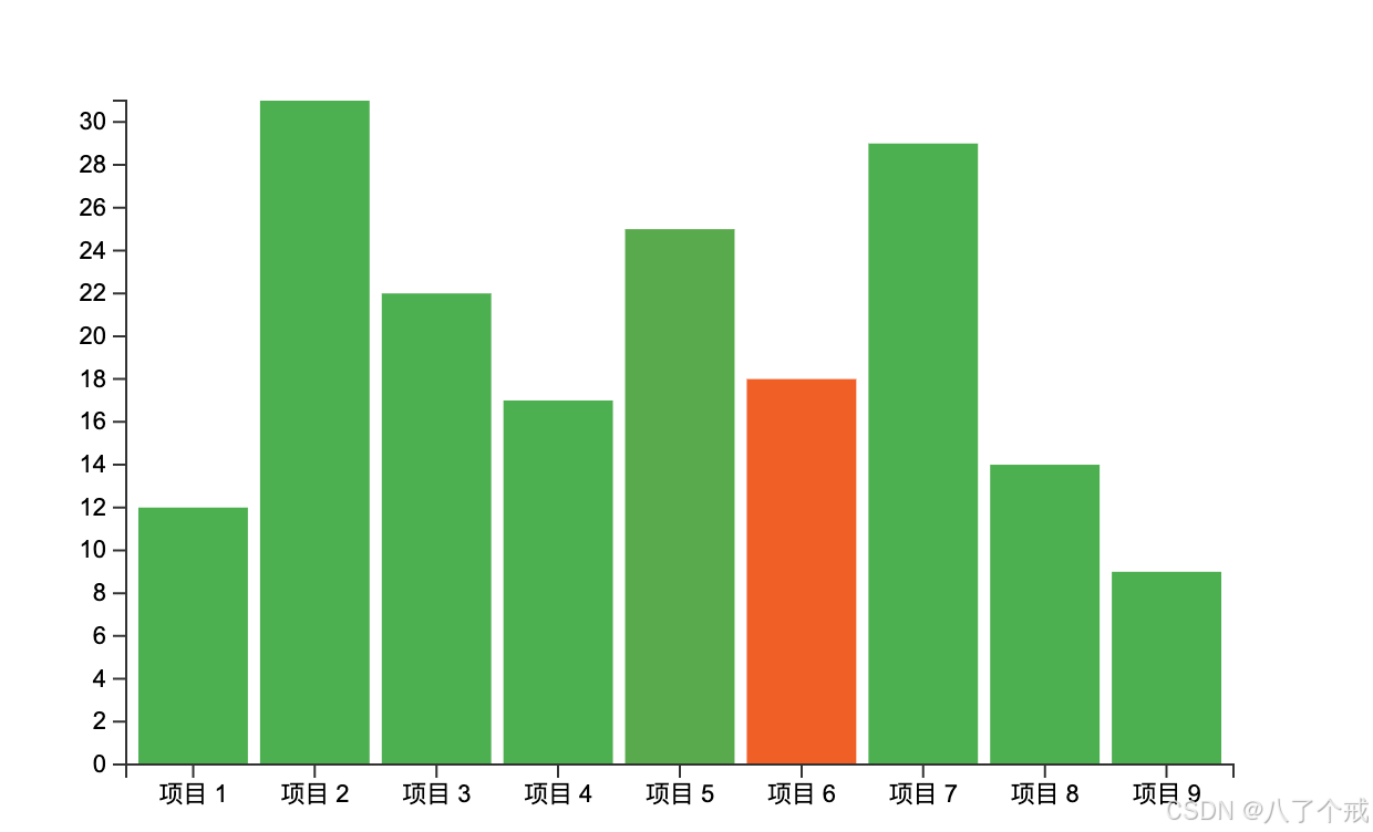
三、完整示例:带坐标轴的柱状图
👇 一个完整的柱状图示例,包含X轴和Y轴:
<!DOCTYPE html>
<html>
<head>
  <script src="https://d3js.org/d3.v7.min.js"></script>
  <style>
    .bar {
      fill: #4CAF50;
      transition: all 0.3s;
    }
    .bar:hover {
      fill: #FF5722;
    }
    .axis path,
    .axis line {
      fill: none;
      stroke: #333;
      shape-rendering: crispEdges;
    }
    .axis text {
      font-family: Arial;
      font-size: 11px;
    }
  </style>
</head>
<body>
  <svg width="600" height="400"></svg>

  <script>
    // 数据集
    const dataset = [12, 31, 22, 17, 25, 18, 29, 14, 9];
    const barPadding = 5;
    const barWidth = 50;

    // 选择SVG容器
    const svg = d3.select("svg");

    // 创建比例尺
    const xScale = d3.scaleBand()
      .domain(d3.range(dataset.length))
      .range([50, 550])
      .padding(0.1);

    const yScale = d3.scaleLinear()
      .domain([0, d3.max(dataset)])
      .range([350, 50]);

    // 创建坐标轴
    const xAxis = d3.axisBottom(xScale)
      .tickFormat(d => `项目 ${d + 1}`);

    const yAxis = d3.axisLeft(yScale);

    // 绘制柱状图
    svg.selectAll(".bar")
      .data(dataset)
      .enter()
      .append("rect")
      .attr("class", "bar")
      .attr("x", (d, i) => xScale(i))
      .attr("y", d => yScale(d))
      .attr("width", xScale.bandwidth())
      .attr("height", d => 350 - yScale(d));

    // 添加X轴
    svg.append("g")
      .attr("class", "axis")
      .attr("transform", "translate(0, 350)")
      .call(xAxis);

    // 添加Y轴
    svg.append("g")
      .attr("class", "axis")
      .attr("transform", "translate(50, 0)")
      .call(yAxis);
  </script>
</body>
</html>
👇 代码效果:
四、坐标轴定制
1. 刻度数量与格式
// 设置刻度数量和格式
const yAxis = d3.axisLeft(yScale)
  .ticks(5)                    // 大约5个刻度
  .tickFormat(d => `${d}个`);  // 添加单位
2. 刻度大小
// 调整刻度大小
const xAxis = d3.axisBottom(xScale)
  .tickSizeInner(10)   // 内部刻度线长度
  .tickSizeOuter(20);  // 外部刻度线长度
3. 自定义刻度值
// 指定精确的刻度值
const yAxis = d3.axisLeft(yScale)
  .tickValues([0, 15, 30, 45, 60]);
五、时间坐标轴
对于时间数据,可以使用时间比例尺和时间坐标轴:
// 时间数据示例
const timeData = [
  {date: new Date(2023, 0, 1), value: 30},
  {date: new Date(2023, 1, 1), value: 40},
  // 更多数据...
];

// 创建时间比例尺
const xTimeScale = d3.scaleTime()
  .domain(d3.extent(timeData, d => d.date))
  .range([50, 550]);

// 创建时间坐标轴
const xTimeAxis = d3.axisBottom(xTimeScale)
  .ticks(d3.timeMonth.every(1))  // 每月一个刻度
  .tickFormat(d3.timeFormat("%b %Y")); // 格式化为"月 年"

// 渲染时间坐标轴
svg.append("g")
  .attr("transform", "translate(0, 350)")
  .call(xTimeAxis);
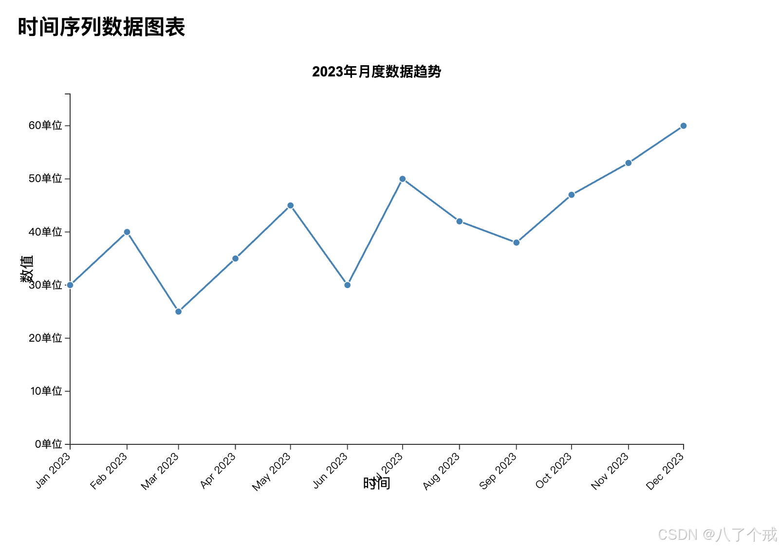
👇 完整代码示例:
<!DOCTYPE html>
<html>
<head>
  <script src="https://d3js.org/d3.v7.min.js"></script>
  <style>
    body {
      font-family: Arial, sans-serif;
      margin: 20px;
    }
    .chart-container {
      width: 800px;
      height: 500px;
    }
    .axis path,
    .axis line {
      fill: none;
      stroke: #333;
      shape-rendering: crispEdges;
    }
    .axis text {
      font-size: 12px;
    }
    .line {
      fill: none;
      stroke: steelblue;
      stroke-width: 2px;
    }
    .dot {
      fill: steelblue;
      stroke: #fff;
    }
  </style>
</head>
<body>
  <h2>时间序列数据图表</h2>
  <div class="chart-container">
    <svg width="100%" height="100%"></svg>
  </div>

  <script>
    // 1. 准备时间序列数据
    const timeData = [
      { date: new Date(2023, 0, 1), value: 30 },
      { date: new Date(2023, 1, 1), value: 40 },
      { date: new Date(2023, 2, 1), value: 25 },
      { date: new Date(2023, 3, 1), value: 35 },
      { date: new Date(2023, 4, 1), value: 45 },
      { date: new Date(2023, 5, 1), value: 30 },
      { date: new Date(2023, 6, 1), value: 50 },
      { date: new Date(2023, 7, 1), value: 42 },
      { date: new Date(2023, 8, 1), value: 38 },
      { date: new Date(2023, 9, 1), value: 47 },
      { date: new Date(2023, 10, 1), value: 53 },
      { date: new Date(2023, 11, 1), value: 60 }
    ];

    // 2. 设置SVG尺寸和边距
    const margin = { top: 40, right: 40, bottom: 60, left: 60 };
    const width = 800 - margin.left - margin.right;
    const height = 500 - margin.top - margin.bottom;

    // 3. 创建SVG容器
    const svg = d3.select("svg")
      .attr("width", width + margin.left + margin.right)
      .attr("height", height + margin.top + margin.bottom)
      .append("g")
      .attr("transform", `translate(${margin.left},${margin.top})`);

    // 4. 创建时间比例尺
    const xTimeScale = d3.scaleTime()
      .domain(d3.extent(timeData, d => d.date)) // 自动计算时间范围
      .range([0, width]);

    // 5. 创建数值比例尺
    const yLinearScale = d3.scaleLinear()
      .domain([0, d3.max(timeData, d => d.value) * 1.1]) // 留出10%空间
      .range([height, 0]);

    // 6. 创建时间坐标轴
    const xAxis = d3.axisBottom(xTimeScale)
      .ticks(d3.timeMonth.every(1)) // 每月一个刻度
      .tickFormat(d3.timeFormat("%b %Y")); // 格式化为"月 年"

    // 7. 创建数值坐标轴
    const yAxis = d3.axisLeft(yLinearScale)
      .ticks(6)
      .tickFormat(d => `${d}单位`);

    // 8. 渲染X轴
    svg.append("g")
      .attr("class", "axis x-axis")
      .attr("transform", `translate(0,${height})`)
      .call(xAxis)
      .selectAll("text")
        .attr("transform", "rotate(-45)")
        .attr("dx", "-.8em")
        .attr("dy", ".15em")
        .style("text-anchor", "end");

    // 9. 渲染Y轴
    svg.append("g")
      .attr("class", "axis y-axis")
      .call(yAxis);

    // 10. 添加X轴标签
    svg.append("text")
      .attr("transform", `translate(${width / 2}, ${height + margin.bottom - 10})`)
      .style("text-anchor", "middle")
      .text("时间");

    // 11. 添加Y轴标签
    svg.append("text")
      .attr("transform", "rotate(-90)")
      .attr("y", 0 - margin.left)
      .attr("x", 0 - (height / 2))
      .attr("dy", "1em")
      .style("text-anchor", "middle")
      .text("数值");

    // 12. 创建折线生成器
    const line = d3.line()
      .x(d => xTimeScale(d.date))
      .y(d => yLinearScale(d.value));

    // 13. 绘制折线
    svg.append("path")
      .datum(timeData)
      .attr("class", "line")
      .attr("d", line);

    // 14. 添加数据点
    svg.selectAll(".dot")
      .data(timeData)
      .enter()
      .append("circle")
      .attr("class", "dot")
      .attr("cx", d => xTimeScale(d.date))
      .attr("cy", d => yLinearScale(d.value))
      .attr("r", 4)
      .append("title") // 添加悬停提示
        .text(d => `${d3.timeFormat("%Y年%m月%d日")(d.date)}: ${d.value}单位`);

    // 15. 添加图表标题
    svg.append("text")
      .attr("x", width / 2)
      .attr("y", 0 - (margin.top / 2))
      .attr("text-anchor", "middle")
      .style("font-size", "16px")
      .style("font-weight", "bold")
      .text("2023年月度数据趋势");
  </script>
</body>
</html>
👇 代码效果:
六、坐标轴样式调整
可以通过CSS或D3方法调整坐标轴样式:
/* CSS方式 */
.axis path {
  stroke: #777;
  stroke-width: 2px;
}
.axis text {
  fill: #555;
  font-size: 12px;
}
.axis line {
  stroke: #ddd;
  stroke-dasharray: 2,2;
}
// D3方式
svg.selectAll(".axis path")
  .attr("stroke", "#777")
  .attr("stroke-width", 2);

svg.selectAll(".axis text")
  .attr("fill", "#555")
  .attr("font-size", "12px");
七、常见问题与解决方案
1. 坐标轴位置不正确
确保设置了正确的transform属性:
// 底部坐标轴通常需要向下平移
.attr("transform", `translate(0, ${height - margin.bottom})`)
2. 刻度标签重叠
解决方法:
- 减少刻度数量:
.ticks(5) - 旋转标签:
.selectAll("text").attr("transform", "rotate(-45)") - 调整标签位置:
.attr("dy", ".35em").attr("dx", "-.8em")
3. 坐标轴更新
当数据变化时,需要重新调用坐标轴:
// 更新比例尺域
xScale.domain(newDomain);

// 重新调用坐标轴
svg.select(".x-axis").call(xAxis);
小结
核心三要素: 比例尺→生成器→渲染
四大方向: Top/Bottom/Left/Right
定制关键:
- 刻度控制
.ticks() - 标签格式化
.tickFormat() - 样式调整CSS/D3方法
- 刻度控制
时间轴要点: 用
scaleTime()+时间格式化常见技巧:
- 防标签重叠:旋转45度
- 数据更新:先改
domain再call - 准确定位:注意
transform