目录
Python数据可视化:从入门到精通绘制完美柱状图
柱状图是数据可视化中最常用的图表类型之一,本文将带你从基础绘制到高级定制,全面掌握Python绘制柱状图的技巧,并附参数速查表。
一、基础篇:快速绘制柱状图
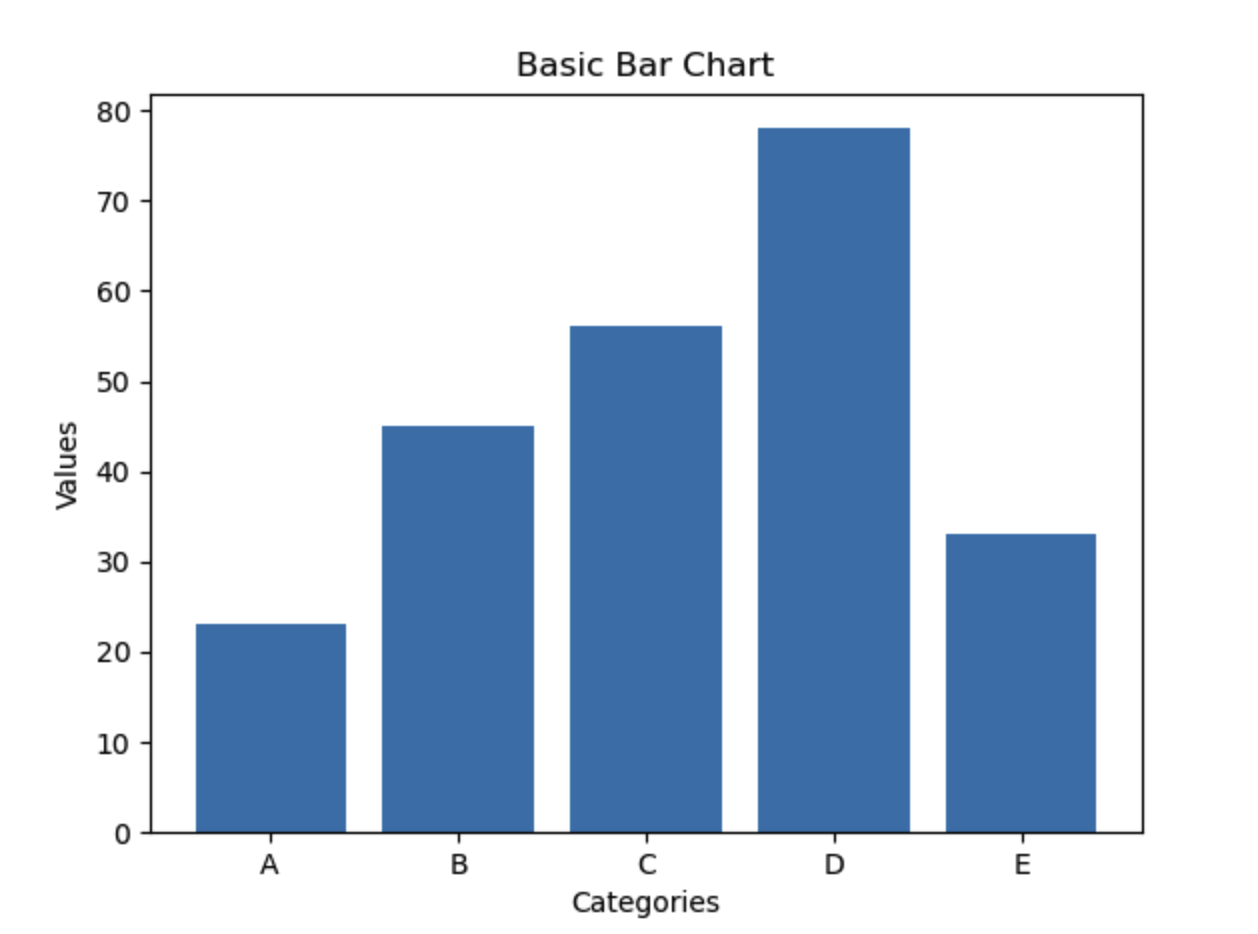
1.1 使用Matplotlib基础绘制
import matplotlib.pyplot as plt

data = [23, 45, 56, 78, 33]
labels = ['A', 'B', 'C', 'D', 'E']

plt.bar(labels, data)
plt.title('Basic Bar Chart')
plt.xlabel('Categories')
plt.ylabel('Values')
plt.show()
效果展示:
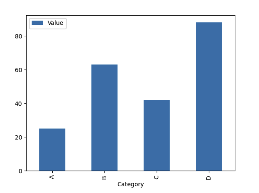
1.2 使用Pandas快速绘图
import matplotlib.pyplot as plt
import pandas as pd

df = pd.DataFrame({
    'Category': ['A', 'B', 'C', 'D'],
    'Value': [25, 63, 42, 88]
})

df.plot(kind='bar', x='Category', y='Value')
plt.show()
效果展示:
二、进阶篇:专业级柱状图定制
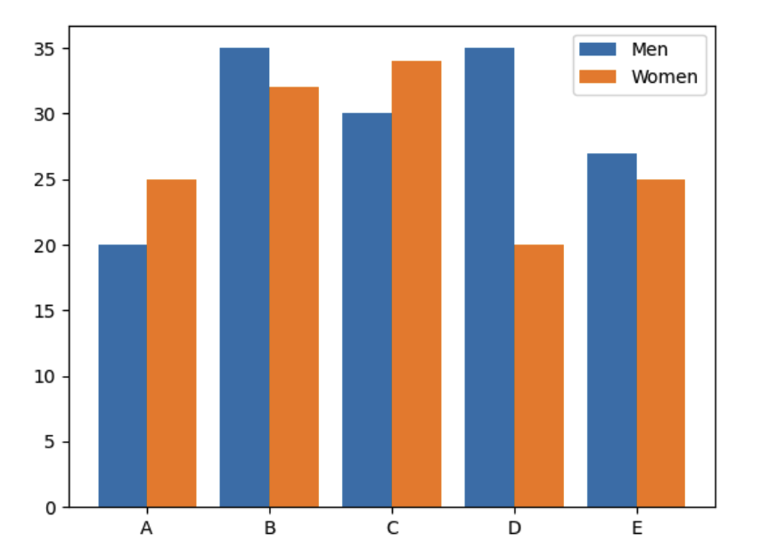
2.1 多系列柱状图
import numpy as np
import matplotlib.pyplot as plt

labels = ['A', 'B', 'C', 'D', 'E']
men_means = [20, 35, 30, 35, 27]
women_means = [25, 32, 34, 20, 25]
x = np.arange(len(labels))

plt.bar(x - 0.2, men_means, 0.4, label='Men')
plt.bar(x + 0.2, women_means, 0.4, label='Women')
plt.xticks(x, labels)
plt.legend()
plt.show()
效果展示:
2.2 堆叠柱状图
plt.bar(labels, data1, label='Series 1')
plt.bar(labels, data2, bottom=data1, label='Series 2')
2.3 水平柱状图
plt.barh(labels, data, height=0.6)
三、专业参数速查表
Matplotlib bar() 核心参数
| 参数分类 | 参数名称 | 类型 | 作用描述 | 示例值 |
|---|---|---|---|---|
| 基本参数 | x | array-like | x轴坐标位置 | [0,1,2,3] |
| height | array-like | 柱体高度 | [10,20,30] | |
| width | float | 柱体宽度 | 0.8 | |
| 样式参数 | color | str/list | 柱体颜色 | ‘blue’ 或 [‘r’,‘g’,‘b’] |
| edgecolor | str | 边框颜色 | ‘black’ | |
| linewidth | float | 边框宽度 | 1.5 | |
| alpha | float(0-1) | 透明度 | 0.7 | |
| 标签参数 | tick_label | list | 坐标轴标签 | [‘A’,‘B’,‘C’] |
| label | str | 图例标签 | ‘Sales’ | |
| 布局参数 | align | {‘center’,‘edge’} | 对齐方式 | ‘center’ |
| orientation | {‘v’,‘h’} | 方向 | ‘v’ | |
| 高级参数 | hatch | str | 填充图案 | ‘/’, ‘O’, ‘x’ |
| error_kw | dict | 误差线参数 | {‘elinewidth’:2} | |
| log | bool | 对数坐标 | True |
常用方法扩展:
# 添加数值标签
for rect in bars:
    height = rect.get_height()
    plt.annotate(f'{height}',
                 xy=(rect.get_x() + rect.get_width()/2, height),
                 ha='center', va='bottom')

# 设置样式模板
plt.style.use('ggplot')

# 保存高清图
plt.savefig('output.png', dpi=300, bbox_inches='tight')
四、专家级技巧
4.1 动态柱状图
from matplotlib.animation import FuncAnimation

fig = plt.figure()
def update(frame):
    plt.cla()
    # 更新数据逻辑
    plt.bar(...)
ani = FuncAnimation(fig, update, frames=100)
4.2 大数据优化
# 使用numpy优化计算
data = np.random.rand(10000)
plt.hist(data, bins=50)  # 直方图变种

# 降采样显示
plt.bar(range(0,1000,10), data[::10])
五、最佳实践总结
配色方案:使用seaborn颜色主题
import seaborn as sns sns.set_palette("husl")标签处理:自动旋转长标签
plt.xticks(rotation=45, ha='right")输出格式:矢量图优先
plt.savefig('chart.svg', format='svg')
通过掌握这些技巧,你可以轻松制作出适合学术论文、商业报告等各种场景的专业级柱状图。建议保存参数速查表作为日常参考,并多加实践不同参数的组合效果。