
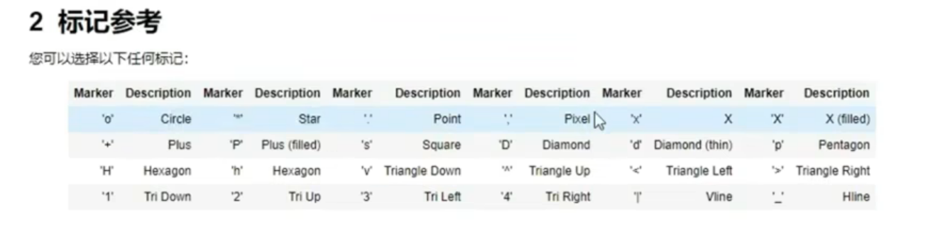
#标记
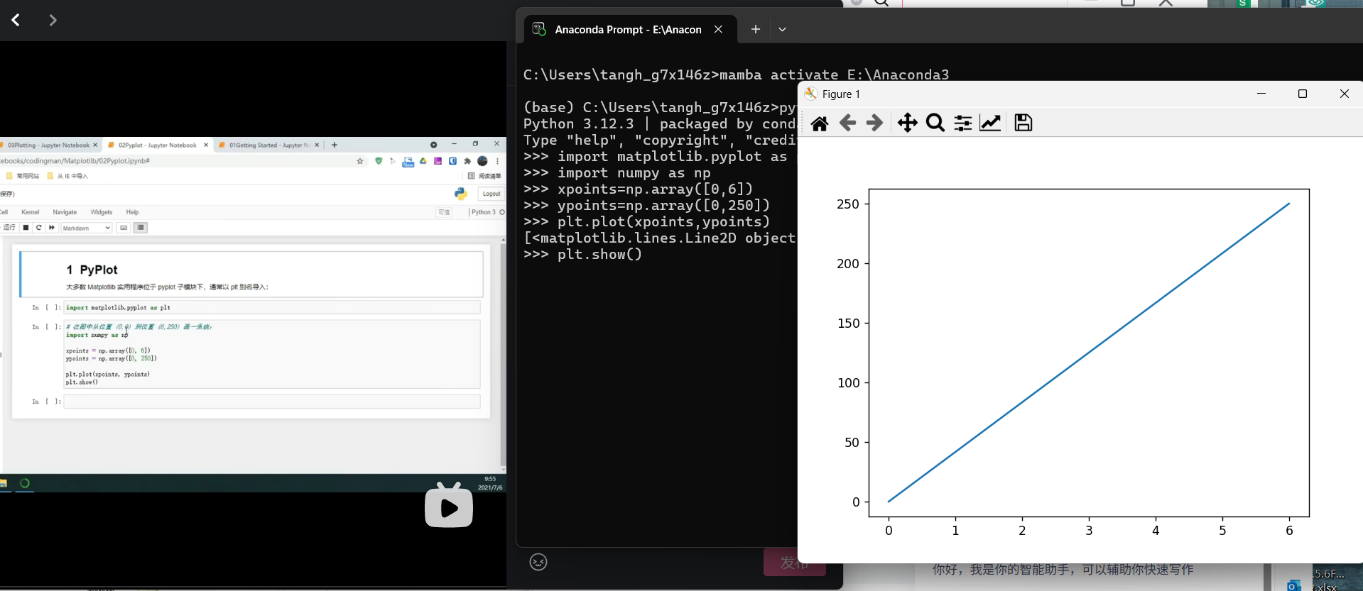
# import matplotlib.pyplot as plt
# import numpy as np
#
# ypoints=np.array([0,5,2,7])
# plt.plot(ypoints,marker='*',ms=20,mec='r',mfc='r')
# plt.show()
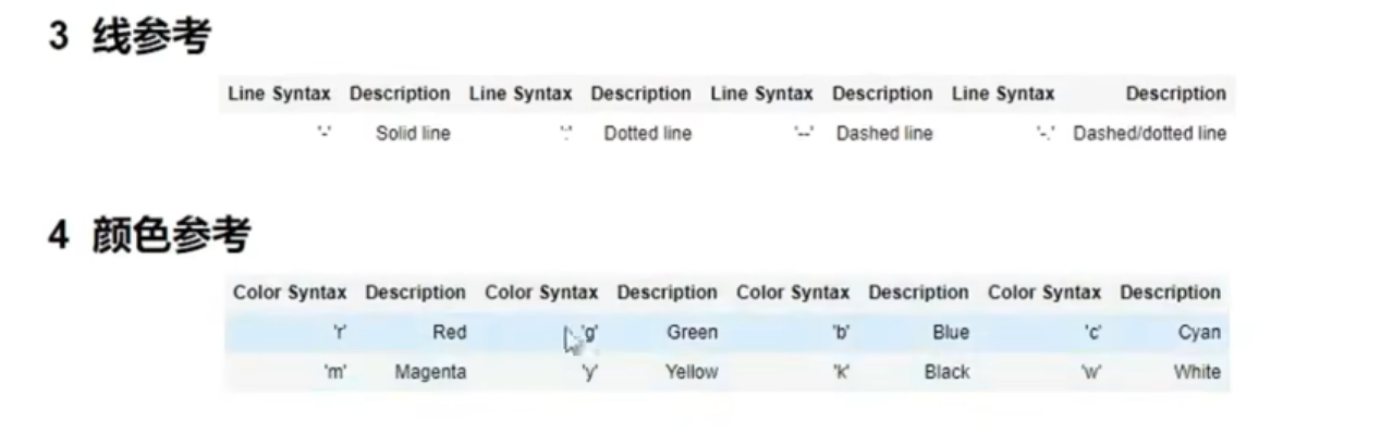
#线条
#
# y=np.array([0,5,2,7])
# plt.plot(y,c='b',linewidth='2',linestyle='dotted',marker='*',ms=20,mec='r',mfc='r')
# #更断的语法:linestyle=ls,dotted=:,dashed=--
# #多行:
# y2=np.array([1,8,7,9])
# plt.plot(y2,c='b',linewidth='2',linestyle='dotted',marker='*',ms=20,mec='r',mfc='r')
# plt.plot(y)
# plt.plot(y2)
# plt.show()
# x1=([0,1,2,3])
# y1=([0,7,9,5])
# x2=([6,4,2,8])
# y2=([3,2,1,5])
# plt.plot(x1,y1,x2,y2)
# plt.show()
#
# 标签
# import matplotlib
# import matplotlib.pyplot as plt
# import numpy as np
# x=np.array([80,85,90,95,100,105,110,115,120,125])
# y=np.array([80,85,90,95,100,105,110,115,120,125])
# font1 = {'family': 'sans-serif', 'color': 'darkblue', 'size': 20}
# font2 = {'family': 'Arial', 'color': 'brown', 'size': 10, 'weight': 'bold'}
# plt.title('李欣逆天言行',loc='left',fontdict=font1)#字体默认在中间
# plt.xlabel('平均逆天次数',fontdict=font2)
# plt.ylabel('消耗卡路里',fontdict=font2)
# plt.plot(x,y)
# plt.show()
#标签
# import matplotlib
# import matplotlib.pyplot as plt
# import numpy as np
# matplotlib.rcParams['font.sans-serif']=['KaiTi']
# x=np.array([80,85,90,95,100,105,110,115,120,125])
# y=np.array([80,85,90,95,100,105,110,115,120,125])
# font1 = {'family': 'KaiTi', 'color': 'darkblue', 'size': 20}
# font2 = {'family': 'KaiTi', 'color': 'brown', 'size': 10}
# plt.title('李欣逆天言行',fontdict=font1)#字体默认在中间
# plt.xlabel('平均逆天次数',loc='right',fontdict=font2)
# plt.ylabel('消耗卡路里',loc='top',fontdict=font2)
# plt.plot(x,y)
# plt.show()
#网格
# import matplotlib
# import matplotlib.pyplot as plt
# import numpy as np
# matplotlib.rcParams['font.sans-serif']=['KaiTi']
# x=np.array([80,85,90,95,100,105,110,115,120,125])
# y=np.array([80,85,90,95,100,105,110,115,120,125])
# font1 = {'family': 'KaiTi', 'color': 'darkblue', 'size': 20}
# font2 = {'family': 'KaiTi', 'color': 'brown', 'size': 10}
# plt.title('李欣逆天言行',fontdict=font1)#字体默认在中间
# plt.xlabel('平均逆天次数',loc='right',fontdict=font2)
# plt.ylabel('消耗卡路里',loc='top',fontdict=font2)
# plt.plot(x,y)
#
# plt.grid(color='green',linestyle='--',linewidth=1.5)#默认为xy
#
# plt.show()
#多图
# import matplotlib
# import matplotlib.pyplot as plt
# import numpy as np
# #plot1
# x=np.array([0,1,2,3])
# y=np.array([3,8,1,10])
#
# plt.subplot(1,2,1)
# plt.plot(x,y)
# plt.title('SALES')
#
# #plot2
# x=np.array([0,1,2,3])
# y=np.array([10,20,30,40])
#
# plt.subplot(1,2,2)
# plt.plot(x,y)
# plt.title('INCOME')
#
# plt.suptitle('MY SHOP')
# plt.show()
#散点图
# import matplotlib
# import matplotlib.pyplot as plt
# import numpy as np
#
# x = np.array([5, 7, 8, 7, 2, 17, 2, 9, 4, 11, 12, 9, 6])
# y = np.array([95, 80, 87, 88, 111, 86, 103, 87, 94, 78, 77, 85, 86])
# # #colors=np.array([与坐标相对应的颜色])来给每个点上不同的颜色
# #sizes=np.arrary([尺寸])再将sizes通过s=sizes添加到plt.scatter中
# # plt.scatter(x,y,color='hotpink')
# # plt.show()
# #颜色图
# # 生成与数据点数量一致的colors数组(示例)
# colors = np.linspace(0, 120, len(x)) # 创建0-100均匀分布的13个值[4,6](@ref)
# plt.scatter(x,y,c=colors,cmap='viridis',alpha=0.5)
# #alpha为透明度
# plt.colorbar()
# plt.show()
#柱状图
#竖直柱状图
# import matplotlib
# import matplotlib.pyplot as plt
# import numpy as np
#
# x=np.array(['A','B','C','D','E','F','G'])
# y=np.array([5, 7, 8, 7, 2, 17, 2])
#
# plt.bar(x,y,color='pink',width=0.3)#竖直#十六进制颜色
# # plt.barh(x,y)#水平
# plt.show()
#直方图:hist函数
# import matplotlib
# import matplotlib.pyplot as plt
# import numpy as np
#
# x=np.random.normal(170,10,250)
# print(x)
# plt.hist(x)
# plt.show()
#饼图
import matplotlib
import matplotlib.pyplot as plt
import numpy as np
y=np.array([35,25,15,15,10])
#explode
nyexplode=[0,0.2,0,0,0]
#colors数组来设置颜色
#标签
nylable=['APPLE','BANANA','CHERRIES','DATES','LINZIN']
plt.pie(y,labels=nylable,startangle=360,explode=nyexplode,shadow=True)#从90度开始画的第二个饼状图突出距离为0.2
plt.legend(title='Four Fruits:')
plt.show()