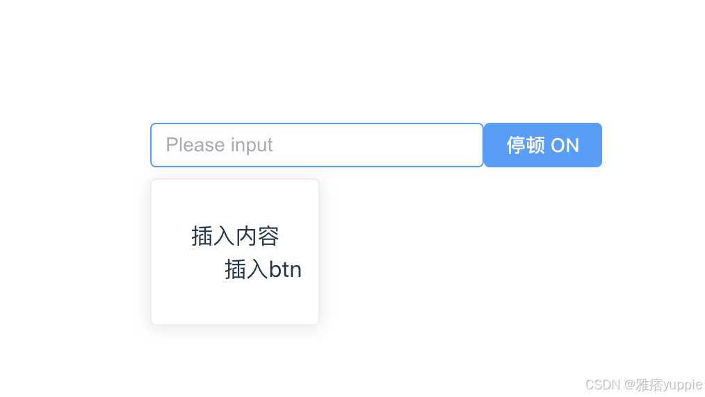
主要功能:
- 点击"停顿"按钮切换对话框显示状态
- 输入框聚焦时保持状态
- 点击对话框外的区域自动关闭
以下是代码版本:
<template>
  <div class="input-container">
    <el-input
      v-model="input"
      style="width: 240px"
      placeholder="Please input"
      ref="inputRef"
      class="input-ref"
      @focus="handleFocus"
    />
    <el-button
      class="input-btn"
      @click.stop="toggleDialog"
      :disabled="!isFocused"
      :type="showDialog ? 'primary' : ''"
    >
      停顿 {{ isFocused ? 'ON' : 'OFF' }}
    </el-button>

    <transition name="fade">
      <div v-if="showDialog" class="dialog-wrapper" @click.stop>
        <dl class="dialog-content">
          <dt>插入内容</dt>
          <dd @click="closeDialog" style="cursor: pointer">插入btn</dd>
        </dl>
      </div>
    </transition>
  </div>
</template>

<script lang="ts" setup>
import { ref, onMounted, onBeforeUnmount } from "vue";

const showDialog = ref(false);
const input = ref("");
const inputRef = ref<HTMLInputElement>();
const isFocused = ref(false);

const handleDocumentClick = (e: MouseEvent) => {
  const target = e.target as HTMLElement;
  const clickedInside = target.closest(".input-container");

  if (!clickedInside && isFocused.value) {
    closeDialog();
  }
};

onMounted(() => {
  document.addEventListener("click", handleDocumentClick);
});

onBeforeUnmount(() => {
  document.removeEventListener("click", handleDocumentClick);
});

function closeDialog() {
  showDialog.value = false;
  if (inputRef.value) {
    inputRef.value.blur();
  }
  isFocused.value = false;
}

function handleFocus() {
  isFocused.value = true;
}

function toggleDialog() {
  showDialog.value = !showDialog.value;
  if (inputRef.value) {
    inputRef.value.focus();
  }
}
</script>

<style scoped>
.input-container {
  position: relative;
  display: inline-block;
}

.dialog-wrapper {
  position: absolute;
  top: 100%;
  left: 0;
  margin-top: 8px;
  padding: 12px;
  background: white;
  border: 1px solid #ebeef5;
  border-radius: 4px;
  box-shadow: 0 2px 12px 0 rgba(0,0,0,0.1);
  z-index: 2000;
}

.fade-enter-active, .fade-leave-active {
  transition: opacity 0.2s;
}
.fade-enter-from, .fade-leave-to {
  opacity: 0;
}
</style>
主要优点:
更好的结构:
- 添加了容器元素
.input-container方便定位 - 使用 transition 实现平滑的对话框动画
- 添加了容器元素
安全的实现:
- 添加了类型定义
inputRef.value为HTMLInputElement - 使用生命周期钩子管理事件监听
- 添加了点击对话框防止事件冒泡的
@click.stop
- 添加了类型定义
用户体验:
- 按钮状态更直观 (添加了 primary 样式)
- 添加了过渡动画
- 对话框样式更美观
代码组织:
- 重命名方法更语义化 (
toggleDialog替代 [pauseInput] - 分离了关闭逻辑到
closeDialog方法
- 重命名方法更语义化 (
DOM 检查优化:
- 使用整个容器检查替代具体元素检查