1.Row 水平排列
(1)MainAxisAlignment
主轴
| 属性 | 说明 |
|---|---|
| start | 从主轴的起点开始放置子元素 |
| end | 从主轴的终点开始放置子元素 |
| center | 将子元素放置在主轴的中心 |
| spaceAround | 将主轴方向的空白区域均分,让子元素之间的空白区域相等,单首尾子元素的空白区域为其他空白区的一半 |

void main() {
runApp(MyPage());
}
class MyPage extends StatelessWidget {
const MyPage({super.key});
Widget build(BuildContext context) {
return MaterialApp(theme: ThemeData(), home: MyFul());
}
}
class MyState extends State {
Row row = Row(
children: [Text("目录1"), Text("目录2"), Text("目录3"), Text("目录4"), Text("目录5")],
mainAxisAlignment: MainAxisAlignment.spaceAround,
);
Widget build(BuildContext context) {
return Scaffold(
appBar: AppBar(title: Text("Container"), centerTitle: true),
body: row,
);
}
}
class MyFul extends StatefulWidget {
State<StatefulWidget> createState() {
return MyState();
}
}
(2)crossAxisAlignment
次轴
| 属性 | 说明 |
|---|---|
| start | 在交叉轴上起点处展示 |
| end | 在交叉轴上终点处展示 |
| center | 子元素在交叉轴上居中 |
2.Column 垂直排列
  Column column = Column(
    children: [
      Text("11111"),
      Text("11111"),
      Text("11111"),
      Text("11111"),
      Text("11111"),
    ],
    mainAxisAlignment: MainAxisAlignment.spaceAround,//垂直方向为主轴
  );

3.Flex
row与Column的组合

class MyState extends State {
Flex flex = Flex(
direction: Axis.horizontal,
children: [Text("data1"), Text("data2"), Text("data3"), Text("data4")],
);
Widget build(BuildContext context) {
return Scaffold(
appBar: AppBar(title: Text("Column"), centerTitle: true),
body: flex,
);
}
}
4.Expanded
将子元素的宽度或高度扩展至充满主轴方向的空白空间。Expanded不是多孩子布局,经常与多孩子布局组件组合使用。
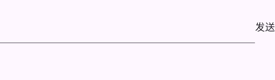
class MyState extends State {
Row row = Row(
children: [
Expanded(flex: 1, child: TextField()), //flex相当于android的weight
Expanded(flex: 0, child: Text("发送")),
],
);
Widget build(BuildContext context) {
return Scaffold(
appBar: AppBar(title: Text("Flex"), centerTitle: true),
body: row,
);
}
}
5.Warp组件
可以将其承载的子元素自动换行的组件。

class MyState extends State {
Wrap wrap = Wrap(
children: [
OutlinedButton(onPressed: () {}, child: Text("data")),
OutlinedButton(onPressed: () {}, child: Text("data")),
OutlinedButton(onPressed: () {}, child: Text("data")),
OutlinedButton(onPressed: () {}, child: Text("data")),
OutlinedButton(onPressed: () {}, child: Text("data")),
OutlinedButton(onPressed: () {}, child: Text("data")),
OutlinedButton(onPressed: () {}, child: Text("data")),
OutlinedButton(onPressed: () {}, child: Text("data")),
OutlinedButton(onPressed: () {}, child: Text("data")),
],
);
Widget build(BuildContext context) {
return Scaffold(
appBar: AppBar(title: Text("Flex"), centerTitle: true),
body: wrap,
);
}
}
6.Stack
可以将其承载的子元素堆叠,
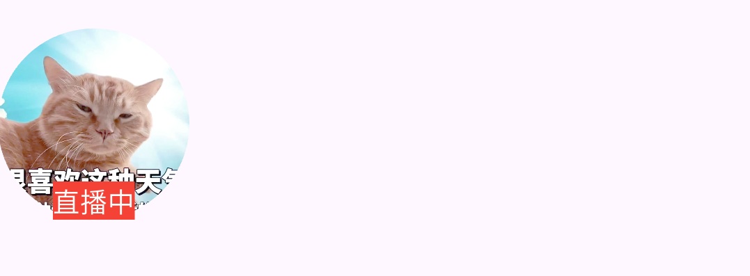
class MyState extends State {
Stack stack = Stack(
alignment: Alignment.bottomCenter,//对齐方式
children: [
CircleAvatar(
radius: 50,
backgroundImage: NetworkImage(
"https://pic.rmb.bdstatic.com/bjh/news/49fa0be5e4ab397fe5a04412d5cfe3f6.png",
),
),
Text(
"直播中",
style: TextStyle(backgroundColor: Colors.red, color: Colors.white),
),
],
);
Widget build(BuildContext context) {
return Scaffold(
appBar: AppBar(title: Text("Flex"), centerTitle: true),
body: stack,
);
}
}
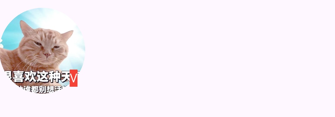
class MyState extends State {
Stack stack = Stack(
alignment: Alignment(0.8, 0.8),
children: [
CircleAvatar(
radius: 50,
backgroundImage: NetworkImage(
"https://pic.rmb.bdstatic.com/bjh/news/49fa0be5e4ab397fe5a04412d5cfe3f6.png",
),
),
Text(
"V",
style: TextStyle(backgroundColor: Colors.red, color: Colors.white),
),
],
);
Widget build(BuildContext context) {
return Scaffold(
appBar: AppBar(title: Text("Flex"), centerTitle: true),
body: stack,
);
}
}
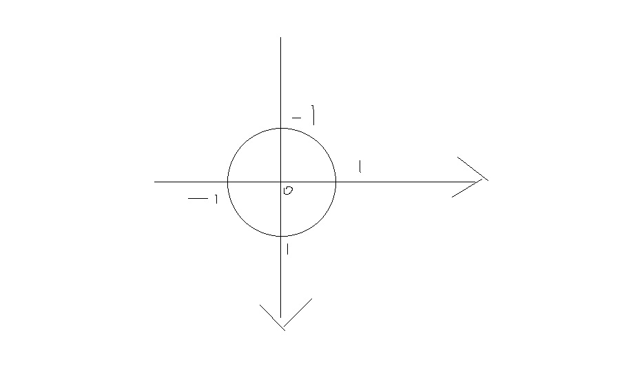
Alignment(0.8, 0.8)跟坐标有关系,(0,0)正好在图片中间。