一、浮动float属性
| 属性值 | 描述 | 适用场景 |
|---|---|---|
left |
元素向左浮动,腾出右侧空间供其他元素使用,其他内容会围绕在其右侧。 | 横向排列元素(如导航菜单)、图文混排布局。 |
right |
元素向右浮动,腾出左侧空间供其他元素使用,其他内容会围绕在其左侧。 | 右侧悬浮按钮、图片右对齐的文本环绕效果。 |
none |
默认值,元素不浮动,按正常文档流排列。 | 取消已有浮动效果,恢复默认布局。 |
inherit |
继承父元素的float属性值。 |
需要子元素与父元素保持相同浮动行为时。 |
inline-start |
元素向行内开始方向浮动(如从左到右的文本中为左浮动,从右到左的文本中为右浮动)。 | 多语言排版适配(如阿拉伯语等从右向左书写的语言)。 |
inline-end |
元素向行内结束方向浮动(如从左到右的文本中为右浮动,从右到左的文本中为左浮动)。 | 与inline-start配合实现动态方向适配。 |
注意事项:
inline-start和inline-end为CSS3新增值,需注意浏览器兼容性。- 浮动元素需明确设置宽度以避免布局错乱(默认宽度由内容撑开)。
- 父容器需通过清除浮动(如
.clearfix伪元素)解决高度塌陷问题
案例:
<!DOCTYPE html>
<html lang="zh-CN">
<head>
<meta charset="UTF-8">
<meta name="viewport" content="width=device-width, initial-scale=1.0">
<title>CSS 浮动特性</title>
<style>
body {
font-family: Arial, sans-serif;
background-color: #f4f4f4;
margin: 0;
padding: 20px;
}
.container {
max-width: 800px;
margin: 0 auto;
background-color: #fff;
padding: 20px;
border-radius: 10px;
box-shadow: 0 0 10px rgba(0, 0, 0, 0.1);
}
.box {
width: 200px;
height: 100px;
margin: 10px;
/* 左浮动 */
/* float: left; */
/* 右浮动 */
/*float: right;*/
background-color: #007BFF;
color: white;
text-align: center;
line-height: 100px;
border-radius: 5px;
}
.clearfix::after {
content: "";
display: block;
/* 清除浮动 */
/* clear: both; */
}
.footer {
background-color: #e3f2fd;
padding: 10px;
text-align: center;
margin-top: 20px;
border-radius: 5px;
}
</style>
</head>
<body>
<div class="container">
<h1>CSS 浮动特性</h1>
<div class="clearfix">
<div class="box">Box 1</div>
<div class="box">Box 2</div>
<div class="box">Box 3</div>
<div class="box">Box 4</div>
</div>
<div class="footer">这是一个底部区域</div>
</div>
</body>
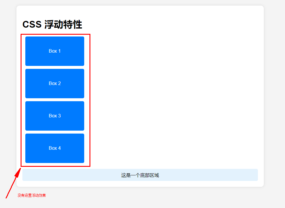
</html>(1)没有浮动
(2)左浮动:float:left;

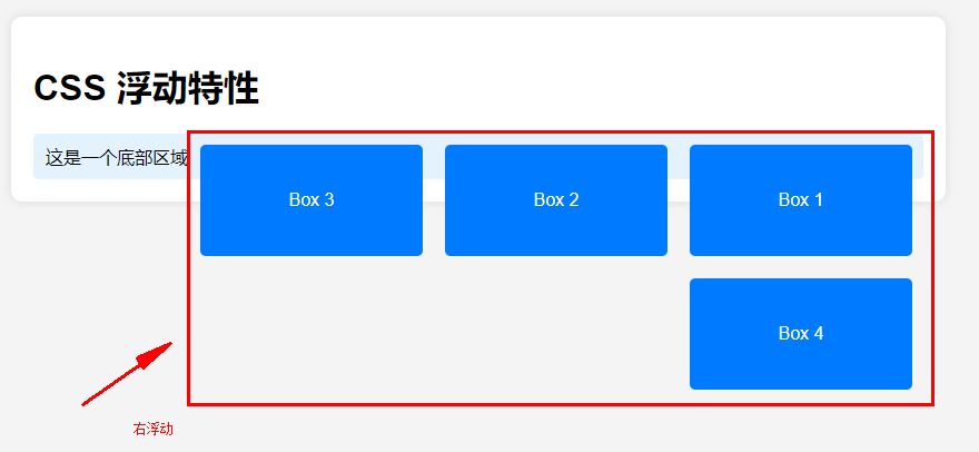
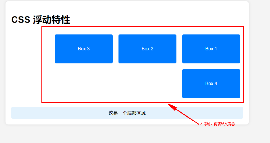
(3)右浮动:float:right;
二、清除浮动clear属性
| 属性值 | 描述 | 典型应用场景 |
|---|---|---|
left |
元素下方不允许存在左浮动元素,强制换行到左浮动元素下方。 | 清除左侧浮动布局 |
right |
元素下方不允许存在右浮动元素,强制换行到右浮动元素下方。 | 清除右侧浮动布局 |
both |
元素下方不允许存在任何浮动元素,强制换行到所有浮动元素下方。 | 通用清除浮动(如父容器包裹浮动子元素时避免高度塌陷) |
none |
默认值,允许元素下方存在浮动元素,不强制换行。 | 取消清除浮动行为,恢复默认布局。 |
inherit |
继承父元素的 clear 属性值。 |
子元素需与父元素保持相同清除行为时使用 |
(4)清除浮动 clear:both;
注意: 父容器需通过清除浮动(如
.clearfix伪元素)解决高度塌陷问题
三、典型应用场景
1、横向导航菜单
<!DOCTYPE html>
<html lang="en">
<head>
    <meta charset="UTF-8">
    <meta name="viewport" content="width=device-width, initial-scale=1.0">
    <title>Document</title>
    <style>
        body {
            font-family: Arial, sans-serif;
            background-color: #f4f4f4;
            margin: 0;
            padding: 20px;
        }

        .nav {
            background-color: #68a4df;
            color: white;
            padding: 10px;
            text-align: center;
            height:30px;
            /* 设置导航栏高度 */
        }

        .item {
            /* display: inline-block; */
            width: 80px;  /* 设置宽度 */
            float: left;  /* 使用浮动布局 */
            margin: 0 15px;
            cursor: pointer;
            line-height: 30px; /* 设置行高与导航栏高度一致 */
        }
    </style>
</head>
<body>
    <div class="nav">
        <div class="item">首页</div>
        <div class="item">产品</div>
        <div class="item">关于</div>
    </div>

</body>
</html>
注意:display: inline-block; 类似于浮动效果
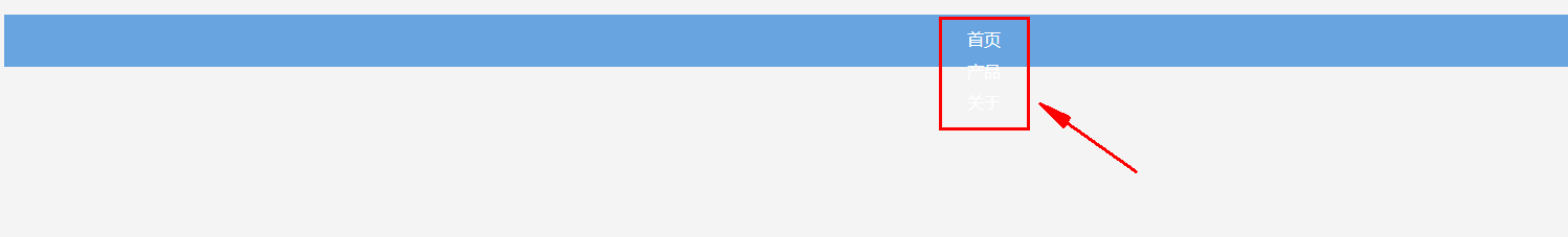
左浮动效果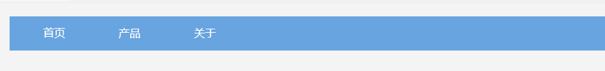
2、两栏/三栏布局
<!DOCTYPE html>
<html lang="zh-CN">
<head>
    <meta charset="UTF-8">
    <meta name="viewport" content="width=device-width, initial-scale=1.0">
    <title>两栏布局</title>
    <style>
        body {
            font-family: Arial, sans-serif;
            margin: 0;
            padding: 0;
        }

        .container {
            width: 80%;
            margin: 20px auto;
            background-color: #f4f4f4;
            overflow: hidden; /* 清除浮动 */
        }

        .left {
            float: left;
            width: 70%; /* 左侧宽度 */
            background-color: #007BFF;
            color: white;
            padding: 20px;
            box-sizing: border-box;
        }

        .right {
            float: left;
            width: 30%; /* 右侧宽度 */
            background-color: #FFC107;
            color: white;
            padding: 20px;
            box-sizing: border-box;
        }
    </style>
</head>
<body>
    <div class="container">
        <div class="left">左侧内容</div>
        <div class="right">右侧内容</div>
    </div>
</body>
</html>
没有浮动效果
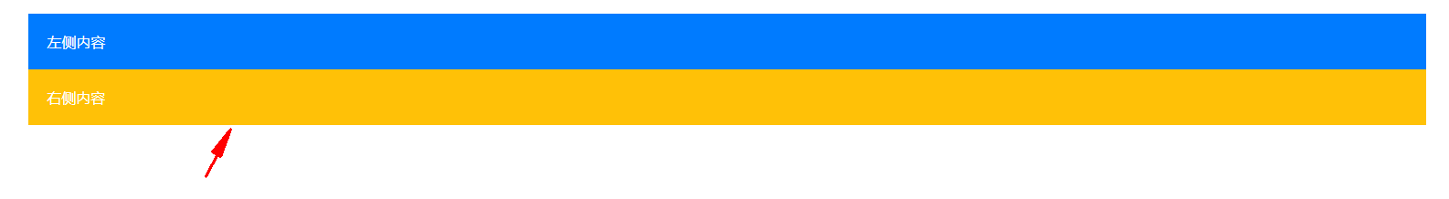
左浮动效果

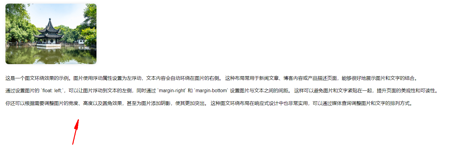
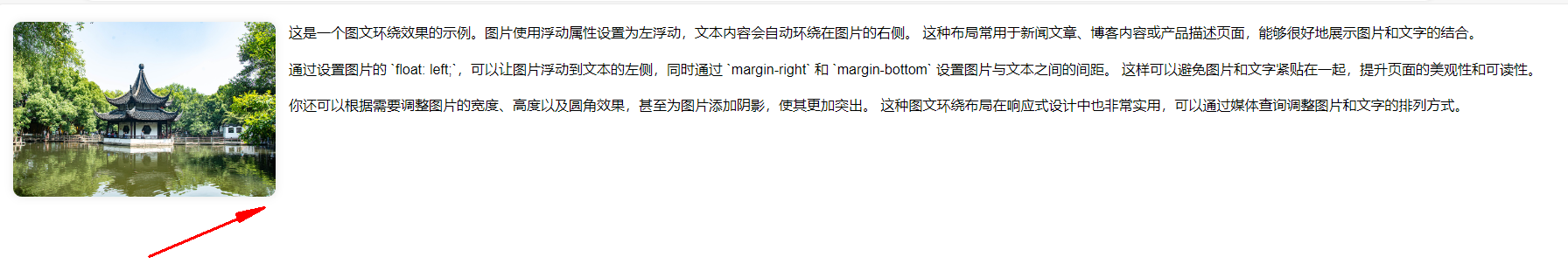
3、图文环绕效果
<!DOCTYPE html>
<html lang="zh-CN">
<head>
    <meta charset="UTF-8">
    <meta name="viewport" content="width=device-width, initial-scale=1.0">
    <title>图文环绕效果</title>
    <style>
        body {
            font-family: Arial, sans-serif;
            line-height: 1.6;
            margin: 20px;
        }

        .image {
            /* 图片左浮动 */
            float: left;
            margin-right: 15px; /* 图片右侧间距 */
            margin-bottom: 10px; /* 图片底部间距 */
            width: 300px; /* 图片宽度 */
            height: auto; /* 保持图片比例 */
            border-radius: 10px; /* 圆角效果 */
            box-shadow: 0 0 10px rgba(0, 0, 0, 0.1); /* 图片阴影 */
        }


        .content {
            text-align: justify; /* 文本两端对齐 */
        }
    </style>
</head>
<body>
    <div class="content">
        <img src="https://preview.qiantucdn.com/58pic/71/78/23/36T58PICmR9Uz7fyhC5m4_origin_PIC2018.jpg!w1024_new_small_1" alt="示例图片" class="image">
        <p>
            这是一个图文环绕效果的示例。图片使用浮动属性设置为左浮动,文本内容会自动环绕在图片的右侧。
            这种布局常用于新闻文章、博客内容或产品描述页面,能够很好地展示图片和文字的结合。
        </p>
        <p>
            通过设置图片的 `float: left;`,可以让图片浮动到文本的左侧,同时通过 `margin-right` 和 `margin-bottom` 设置图片与文本之间的间距。
            这样可以避免图片和文字紧贴在一起,提升页面的美观性和可读性。
        </p>
        <p>
            你还可以根据需要调整图片的宽度、高度以及圆角效果,甚至为图片添加阴影,使其更加突出。
            这种图文环绕布局在响应式设计中也非常实用,可以通过媒体查询调整图片和文字的排列方式。
        </p>
    </div>
</body>
</html>
没有浮动效果
左浮动效果
四、注意事项
- 明确设置宽度 :未设置宽度的浮动元素宽度由内容撑开,可能导致布局错乱。
- 优先现代布局方案:复杂布局建议使用
Flexbox(弹性盒子)或Grid(网格布局),减少浮动带来的维护成本。- 高度塌陷问题 :父容器需清除浮动,否则高度为0(如未闭合的浮动元素会导致页面结构崩溃)。