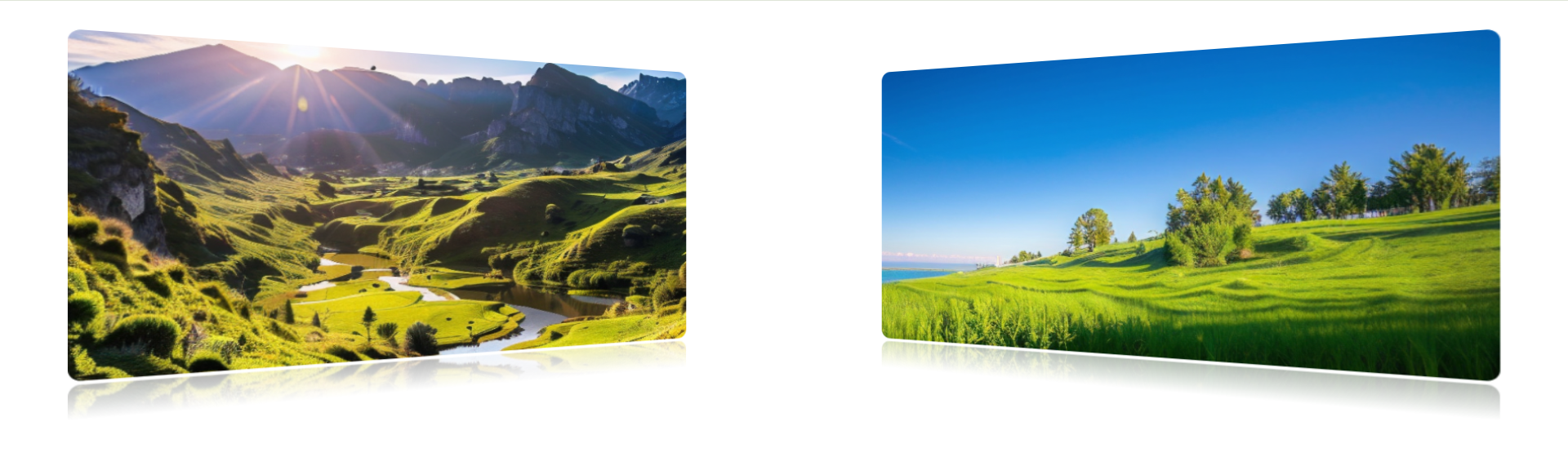
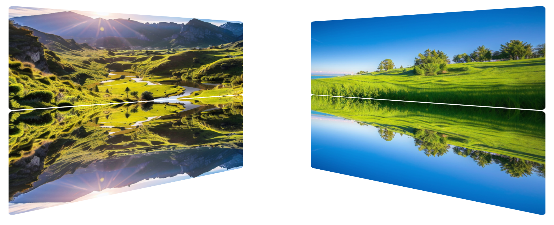
这是需要实现的效果,平时用的比较多的是添加阴影,是box-shadow,而添加倒影是box-reflect,需要注意的是box-reflect需要添加浏览器前缀,比如我用的谷歌浏览器,要加-webkit-才能生效。
-webkit-box-reflect: below 3px linear-gradient(to bottom,
				transparent 90%,
				rgba(0, 0, 0, 0.3) 100%
			);
		/* 参数说明:
		     below - 倒影方向(下方)
		     0px   - 倒影与图片的间距
		     linear-gradient - 渐变遮罩(使倒影渐隐)
		  */
倒影需要注意的是渐变设置,由于倒影是倒过来的,所以上面是bottom,下面是top,如下图所示。0-90%都是透明色,然后90%-100%从透明色渐变成半透明色,遮罩在图片倒影上。
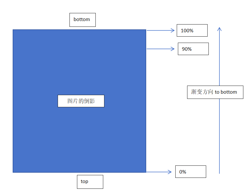
如果不设置渐变,那么就是整个倒影全部显示出来的。
 3d倾斜样式,要现在图片容器上增加透视效果,perspective: 1000px;
然后图片设置transform: translate3d(0px, 0px, -10px) rotateX(0deg) rotateY(30deg) scale(1);
再添加一点动效,比如鼠标hover的时候,图片回正,transform: none;
想要动效更流畅,又加了transition: transform 1s linear;
但是加了transition后悲催的发现,图片旋转回正后会有视觉残留,360浏览器无此问题而谷歌浏览器有,查了一圈资料,加浏览器前缀-webkit-,加
backface-visibility: hidden;
backface-visibility: hidden;
transform-style: preserve-3d;
will-change: transform;
一概不管用。
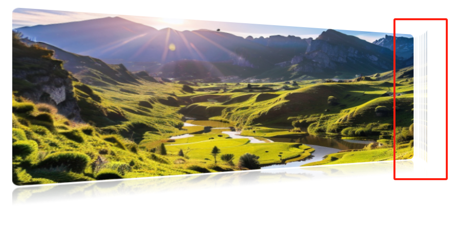
完整代码如下,如果有网友解决了谷歌浏览器视觉残留问题,麻烦给我留个言,非常感谢了。
<template>
	<!-- 倒影案例 -->
	<div class="container">
		<img src="../assets/1.png" />
		<img src="../assets/2.png" />
	</div>
</template>

<script>
</script>

<style scoped>
	.container {
		padding: 50px;
		display: flex;
		justify-content: space-around;		/* 图片左右分布 */
		perspective: 1000px; 		/* 增加3D透视效果 */
	}
	.container img {
		width: 40%;
		height: 300px;
		border-radius: 10px;
		-webkit-box-reflect: below 3px linear-gradient(to bottom,
				transparent 90%,
				rgba(0, 0, 0, 0.3) 100%
			);
		/* 参数说明:
		     below - 倒影方向(下方)
		     0px   - 倒影与图片的间距
		     linear-gradient - 渐变遮罩(使倒影渐隐)
		  */
		transition: transform 1s linear; /*加transition在谷歌浏览器上会有视觉残留问题*/
	}

	/* 图片容器里要设置perspective,子元素的translate3d才能生效*/
	/* 第一张图片往右倾斜 */
	.container img:nth-child(1) {
		transform: translate3d(0px, 0px, -10px) rotateX(0deg) rotateY(30deg) scale(1);
	}

	/* 第二张图片往左倾斜 */
	.container img:nth-child(2) {
		transform: translate3d(0px, 0px, -10px) rotateX(0deg) rotateY(-30deg) scale(1);
	}
	.container img:nth-child(1):hover {
		transform: none;
	}
	.container img:nth-child(2):hover {
		transform: none;
	}

</style>