空间转换
使用transform属性实现元素在空间内的位移、旋转、缩放等效果
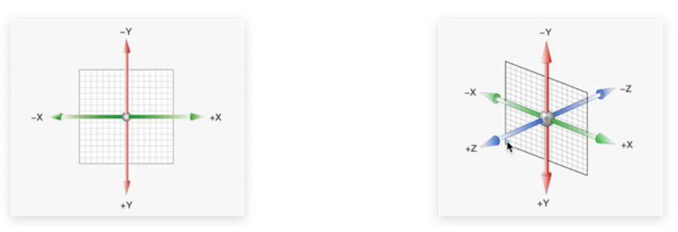
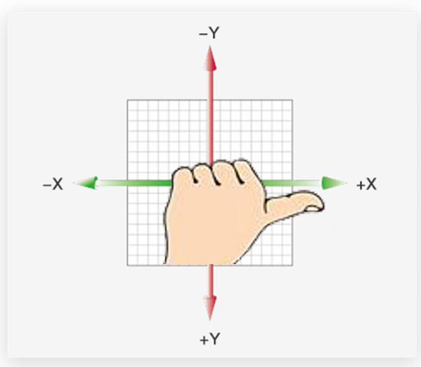
- 空间: 是从坐标轴角度定义的。x、y 和z三条坐标轴构成了一个立体空间,z轴位置与视线方向相同。
- 空间转换也叫3D转换
空间位移
使用translate实现元素空间位移效果
- transform: translate3d(x, y ,z);
- transform: translateX(值);
- transform: translateY(值);
- transform: translateZ(值);
- 取值正负均可, 支持像素单位, 支持百分比单位
- Z轴方向, 正值向我向我靠近, 负值向我远离
<!DOCTYPE html>
<html lang="en">

<head>
  <meta charset="UTF-8">
  <title>空间位移</title>
  <style>
    .box {
      width: 200px;
      height: 200px;
      margin: 100px auto;
      background-color: pink;
      transition: all 0.5s;
    }

    .box:hover {
      transform: translate3d(50px, 100px, 200px);
      transform: translateX(100px);
      transform: translateY(100px);
      /* 目前看不到效果 */
      transform: translateZ(100px);
    }
  </style>
</head>

<body>
  <div class="box"></div>
</body>

</html>
使用perspective属性实现透视效果
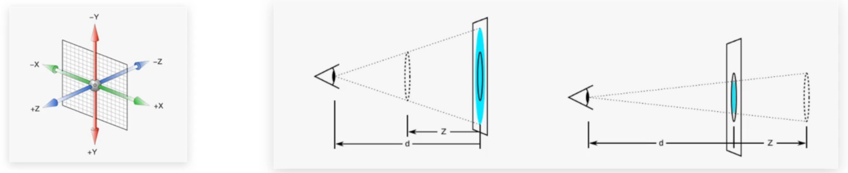
- 思考: 生活中,同一个物体,观察距离不同,视觉上有什么区别 ? 答: 近大远小、近清楚远模糊
- 思考: 默认情况下,为什么无法观察到Z轴位移效果? 答: Z轴是视线方向,移动效果应该是距离的远或近,电脑屏幕是平面,默认无法观察远近效果
- 屏幕想要展现Z轴对元素的影响, 就要通过透视属性, 模拟透视环境, 实现近大远小效果
- 透视属性需要添加给父级元素
- 语法: perspective: 取值;
- 取值支持像素单位, 建议范围800px-1200px
<!DOCTYPE html>
<html lang="en">

<head>
  <meta charset="UTF-8">
  <title>透视效果</title>
  <style>
    body {
      perspective: 1000px;
      /* perspective: 200px; */
      /* perspective: 10000px; */
    }

    .box {
      width: 200px;
      height: 200px;
      margin: 100px auto;
      background-color: pink;
      transition: all 0.5s;
    }

    .box:hover{
      transform: translateZ(200px);
      /* transform: translateZ(-200px); */
    }
  </style>
</head>

<body>
  <div class="box"></div>
</body>

</html>
如果透视距离的取值过大或者过小会怎么样?
- 透视距离也称为视距,所谓的视距就是人的眼睛到屏幕的距离
- 如果perspective的取值很小, 类似于眼睛贴在屏幕上, 元素很小的移动, 都会很夸张的展示, 因为太近了
- 如果perspective的取值很大, 类似于眼睛距离屏幕很远, 元素的移动效果会变弱, 因为太远了
空间旋转
使用rotate实现元素空间旋转效果
- transform: rotateZ(值);
<!DOCTYPE html>
<html lang="en">
<head>
    <meta charset="UTF-8">
    <meta http-equiv="X-UA-Compatible" content="IE=edge">
    <meta name="viewport" content="width=device-width, initial-scale=1.0">
    <title>空间旋转-Z轴</title>
    <style>
        .box {
            width: 300px;
            margin: 100px auto;
        }

        img {
            width: 300px;
            transition: all 2s;
        }

        .box img:hover {
            transform: rotateZ(360deg);
        }
    </style>
</head>
<body>
    <div class="box">
        <img src="./images/hero.jpeg" alt="">
    </div>
</body>
</html>
- transform: rotateX(值);
<!DOCTYPE html>
<html lang="en">
<head>
    <meta charset="UTF-8">
    <meta http-equiv="X-UA-Compatible" content="IE=edge">
    <meta name="viewport" content="width=device-width, initial-scale=1.0">
    <title>空间旋转-X轴</title>
    <style>
        .box {
            width: 300px;
            margin: 100px auto;
        }

        img {
            width: 300px;
            transition: all 2s;
        }

        .box {
            /* 透视效果:近大远小,近实远虚 */
            perspective: 1000px;
        }

        .box img:hover {
            transform: rotateX(60deg);
            transform: rotateX(-60deg);
        }
    </style>
</head>
<body>
    <div class="box">
        <img src="./images/hero.jpeg" alt="">
    </div>
</body>
</html>
- transform: rotateY(值)
<!DOCTYPE html>
<html lang="en">
<head>
    <meta charset="UTF-8">
    <meta http-equiv="X-UA-Compatible" content="IE=edge">
    <meta name="viewport" content="width=device-width, initial-scale=1.0">
    <title>空间旋转-Y轴</title>
    <style>
        .box {
            width: 300px;
            margin: 100px auto;
        }

        img {
            width: 300px;
            transition: all 2s;
        }

        .box {
            /* 透视效果:近大远小,近实远虚 */
            perspective: 1000px;
        }

        .box img:hover {
            transform: rotateY(60deg);
            transform: rotateY(-60deg);
        }
    </style>
</head>
<body>
    <div class="box">
        <img src="./images/hero.jpeg" alt="">
    </div>
</body>
</html>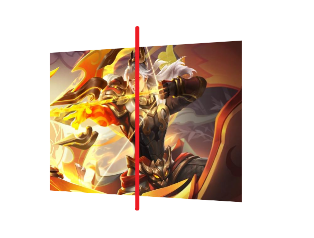
左手法则: 快速判断旋转方向
- 先判断元素的旋转轴, 是X轴 还是Y轴, 还是Z轴
- 左手握住旋转轴, 拇指指向正值方向,
- 手指弯曲的方向就是旋转正值方向
3d旋转:transform:rotate3d(角度);
- rotate3d(x, y, z, 角度度数) :用来设置自定义旋转轴的位置及旋转的角度
- x,y,z 取值为0-1之间的数字
- 其实就是自定义旋转轴, 通过xyz三个坐标, 可以指定空间内的任意旋转轴
- 当标准的xyz轴不能满足需求时, 才会自定义旋转轴
立体呈现: 使用transform-style:preserve-3d呈现立体图形
- 思考: 使用perspective透视属性能否呈现立体图形?
- 答: 不能,perspective只增加近大远小、近实远虚的视觉效果。
- 实现方法:
- 元素的父元素添加 transform-style: preserve-3d;
- 使子元素处于真正的3d空间
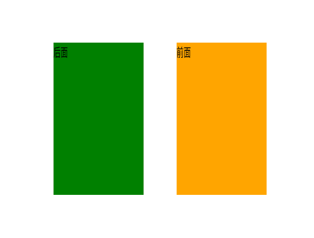
案例: 呈现立体图形步骤
- 盒子父元素添加transform-style:preserve-3d
- 按需求设置子盒子的位置(位移或旋转)
<!DOCTYPE html>
<html lang="en">
<head>
    <meta charset="UTF-8">
    <meta http-equiv="X-UA-Compatible" content="IE=edge">
    <meta name="viewport" content="width=device-width, initial-scale=1.0">
    <title>立体呈现</title>
    <style>
        .cube {
            position: relative;
            width: 200px;
            height: 200px;
            margin: 100px auto;
            background-color: pink;
            transition: all 2s;
             /* 1.父元素开启3d环境  */
            transform-style: preserve-3d;
        }

        .cube div {
            /* 2.两个子元素通过定位叠在一起 */
            position: absolute;
            left: 0;
            top: 0;
            width: 200px;
            height: 200px;
        }

        .front {
            background-color: orange;
            /* 3.正面这个元素在z轴向我位移, 使叠在一起的元素分开,产生空间分离 */
            /* 向我走近200px */
            transform: translateZ(200px);
        }

        .back {
            background-color: green;
        }

        /* cube hover 为了看空间感效果 */
        .cube:hover {
            transform: rotateY(90deg);
        }
    </style>
</head>
<body>
    <div class="cube">
        <div class="front">前面</div>
        <div class="back">后面</div>
    </div>
</body>
</html>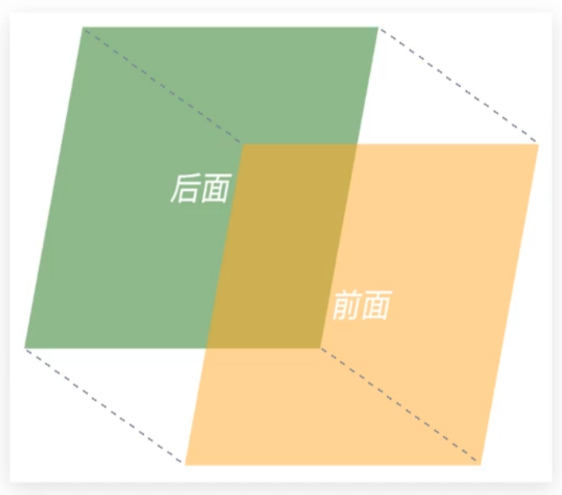
使用立体呈现技巧实现3D导航效果
<!DOCTYPE html>
<html lang="en">

<head>
    <meta charset="UTF-8">
    <meta name="viewport" content="width=device-width, initial-scale=1.0">
    <title>3D导航</title>
    <style>
        ul {
            margin: 0;
            padding: 0;
            list-style: none;
        }

        .navs {
            width: 300px;
            height: 40px;
            margin: 50px auto;
        }

        .navs li {
            position: relative;
            float: left;
            width: 100px;
            height: 40px;
            line-height: 40px;
            transition: all .5s;
            transform-style: preserve-3d;

            /* 旋转: 让大家在写代码的过程中看到立体盒子 */
            /* transform: rotateX(-20deg) rotateY(30deg); */
        }

        .navs li a {
            position: absolute;
            left: 0;
            top: 0;
            display: block;
            width: 100%;
            height: 100%;
            text-align: center;
            text-decoration: none;
            color: #fff;
        }

        .navs li a:first-child {
            background-color: green;
            transform: translateZ(20px);
        }

        .navs li a:last-child {
            background-color: orange;
            /* 躺平x轴旋转  立方体的顶部,位移z(确保看到这个盒子) */
            transform: rotateX(90deg) translateZ(20px);
        }

        /* li:hover 立方体旋转 */
        .navs li:hover {
            transform: rotateX(-90deg);
        }
    </style>
</head>

<body>
    <div class="navs">
        <ul>
            <li>
                <a href="#">首页</a>
                <a href="#">Index</a>
            </li>
            <li>
                <a href="#">登录</a>
                <a href="#">Login</a>
            </li>
            <li>
                <a href="#">注册</a>
                <a href="#">Register</a>
            </li>
        </ul>
    </div>
</body>

</html>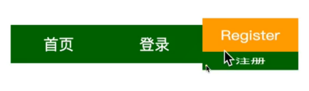
空间缩放
使用scale实现空间缩放效果
- 支持的语法
- transform: scaleX(缩放倍数);
- transform: scaleY(缩放倍数);
- transform: scaleZ(缩放倍数);
- transform: scale3d(x, y, z);
<!DOCTYPE html>
<html lang="en">

<head>
    <meta charset="UTF-8">
    <meta name="viewport" content="width=device-width, initial-scale=1.0">
    <title>3D导航</title>
    <style>
        ul {
            margin: 0;
            padding: 0;
            list-style: none;
        }

        .navs {
            width: 300px;
            height: 40px;
            margin: 50px auto;
        }

        .navs li {
            position: relative;
            float: left;
            width: 100px;
            height: 40px;
            line-height: 40px;
            transition: all .5s;
            transform-style: preserve-3d;

            /* 旋转: 让大家在写代码的过程中看到立体盒子 */
            /* transform: rotateX(-20deg) rotateY(30deg); */

            /* 测试缩放效果 */
            transform: scale3d(0.5, 1.1, 2);
        }

        .navs li a {
            position: absolute;
            left: 0;
            top: 0;
            display: block;
            width: 100%;
            height: 100%;
            text-align: center;
            text-decoration: none;
            color: #fff;
        }

        .navs li a:first-child {
            background-color: green;
            transform: translateZ(20px);
        }

        .navs li a:last-child {
            background-color: orange;
            /* 躺平x轴旋转  立方体的顶部,位移z(确保看到这个盒子) */
            transform: rotateX(90deg) translateZ(20px);
        }

        /* li:hover 立方体旋转 */
        .navs li:hover {
            transform: rotateX(-90deg);
        }
    </style>
</head>

<body>
    <div class="navs">
        <ul>
            <li>
                <a href="#">首页</a>
                <a href="#">Index</a>
            </li>
            <li>
                <a href="#">登录</a>
                <a href="#">Login</a>
            </li>
            <li>
                <a href="#">注册</a>
                <a href="#">Register</a>
            </li>
        </ul>
    </div>
</body>

</html>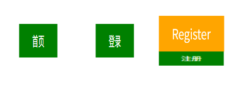
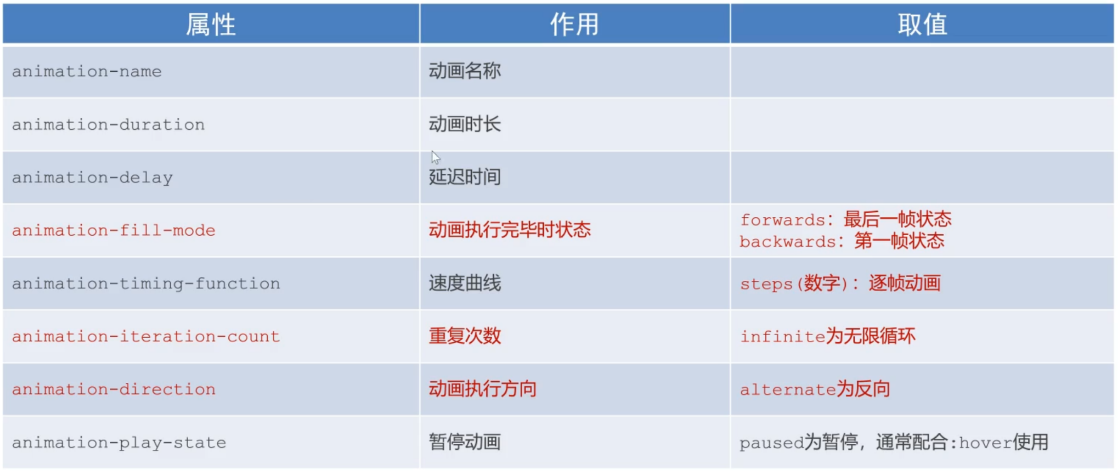
动画属性
介绍
过度效果与动画效果
- 思考: 过渡可以实现什么效果?
- 答: 实现2个状态间的变化过程
- 动画效果: 实现多个状态间的变化过程,动画过程可控(重复播放、最终画面、是否暂停)
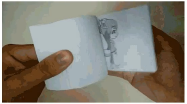
动画的本质是快速切换大量图片时在人脑中形成的具有连续性的画面
- 构成动画的最小单元: 帧或动画帧
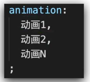
动画的实现
动画的基本使用流程
- 定义动画
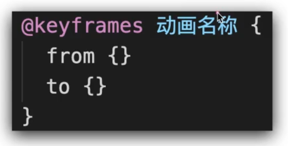
- 使用动画
- 基本使用
<!DOCTYPE html>
<html lang="en">
<head>
<meta charset="UTF-8">
<meta http-equiv="X-UA-Compatible" content="IE=edge">
<meta name="viewport" content="width=device-width, initial-scale=1.0">
<title>动画实现步骤</title>
<style>
.box {
width: 200px;
height: 100px;
background-color: pink;
/* 使用动画 */
animation: change 1s;
}
/* 一. 定义动画:从200变大到600 */
/* @keyframes change {
from {
width: 200px;
}
to {
width: 600px;
}
} */
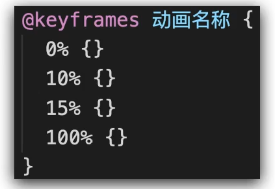
/* 二. 定义动画:200 到 500*300 到 800*500 */
/* 百分比指的是动画总时长的占比 */
/* 动画时长是1s, 所以盒子宽度从200到500的时长是0.5s */
/* 盒子宽度从500到800的时长也是0.5s */
@keyframes change {
0% {
width: 200px;
}
50% {
width: 500px;
height: 300px;
}
100% {
width: 800px;
height: 500px;
}
}
</style>
</head>
<body>
<div class="box"></div>
</body>
</html>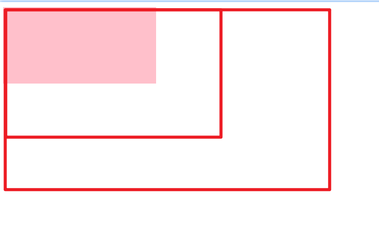
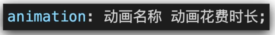
动画属性-复合写法
使用animation相关属性控制动画执行过程

- 动画名称和动画时长必须赋值
- 取值不分先后顺序
- 如果有2个时间值,第一个时间表示动画时长,第二个时间表示延迟时间
<!DOCTYPE html>
<html lang="en">

<head>
    <meta charset="UTF-8">
    <meta http-equiv="X-UA-Compatible" content="IE=edge">
    <meta name="viewport" content="width=device-width, initial-scale=1.0">
    <title>animation复合属性</title>
    <style>
        .box {
            width: 200px;
            height: 100px;
            background-color: pink;

            /* 匀速动画: linear */
            /* animation: change 1s linear; */

            /* 分步动画 */
            /* 把动画分成3步执行, 效果就是一窜一窜的*/
            /* animation: change 1s steps(3); */

            /* 延时动画: 1s后开始播放动画 */
            /* animation: change 1s steps(3) 1s; */

            /* 动画重复3次播放 */
            /* animation: change 1s steps(3) 1s 3; */

            /* 无限循环 */
            /* animation: change 1s infinite; */

            /* 动画方向  */
            /* 默认是单向动画, 动画结束后立即恢复到初始状态  */
            /* alternate双向动画, 动画结束后恢复到初始状态时也有动画效果  */
            /* animation: change 1s infinite alternate; */

            /* 结束状态 */
            /* 动画结束后停留在最初的状态, 默认值, */
            /* animation: change 1s backwards; */

            /* 动画结束后停留在结束状态 */
            animation: change 1s forwards;
        }

        @keyframes change {
            from {
                width: 200px;
            }

            to {
                width: 600px;
            }
        }
    </style>
</head>

<body>
    <div class="box"></div>
</body>

</html>
动画属性-拆分写法
拆分写法和复合写法实现的效果一样, 这里了解一下
<!DOCTYPE html>
<html lang="en">
<head>
    <meta charset="UTF-8">
    <meta http-equiv="X-UA-Compatible" content="IE=edge">
    <meta name="viewport" content="width=device-width, initial-scale=1.0">
    <title>animation拆分写法</title>
    <style>
        .box {
            width: 200px;
            height: 100px;
            background-color: pink;

            animation-name: change;
            animation-duration: 1s;
            animation-iteration-count: infinite;
        }

        .box:hover {
           /* 鼠标移入的时候暂停动画, 离开后恢复动画 */
           animation-play-state: paused;
        }


        @keyframes change {
            from {
                width: 200px;
            }
            to {
                width: 600px;
            }
        }
    </style>
</head>
<body>
    <div class="box"></div>
</body>
</html>
逐帧动画
使用steps实现逐帧动画
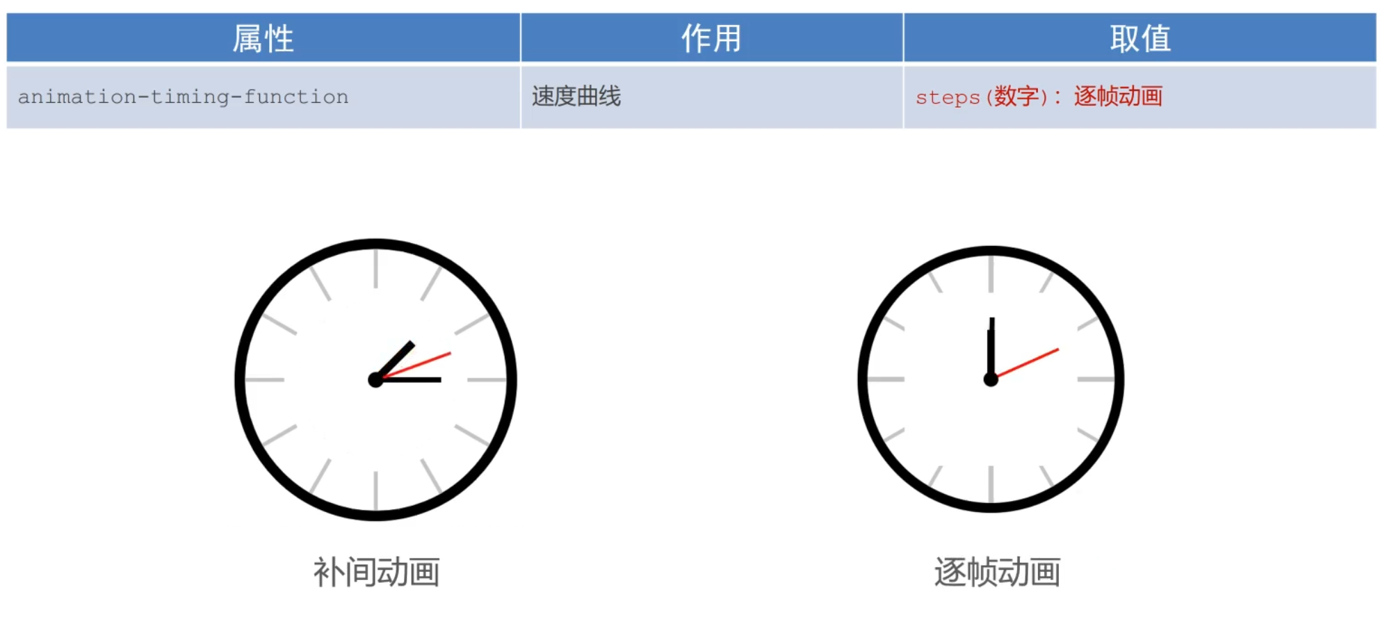
- 补间动画: 两帧之间由程序自动进行插帧, 让动画效果平滑
- 逐帧动画: 两帧之间不进行插针, 动画是一蹦一蹦的
补帧动画一般是配合精灵图, 实现动画效果
- 补帧动画(也叫精灵动画)的原理:
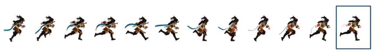
- 实现步骤
- 1. 准备显示区域: 尺寸是精灵图一个画面的尺寸, 将背景图设置为精灵图
- 2. 定义动画: 改变背景图的位置(移动距离是精灵图的宽度)
- 3. 使用动画: 添加速度曲线steps(N), N设置为精灵图画面的个数, 并添加无限重复效果
<!DOCTYPE html>
<html lang="en">
<head>
  <meta charset="UTF-8">
  <title>精灵动画</title>
  <style>
    .box {
      /* 1680/12 : 保证显示区域的尺寸和一个精灵小图的尺寸相同 */
      width: 140px;
      height: 140px;
      /* border: 1px solid #000; */
      background-image: url(./images/bg.png);

      /* 12: 精灵小图的个数 */
      animation: move 1s steps(12) infinite;
    }


    @keyframes move {
        /* from {
          background-position: 0 0;
        } */
        to {
          /* 1680: 精灵图的宽度 */
          background-position:  -1680px 0;
        }
    }

    /* 定义一个盒子移动的动画  800px */
    @keyframes run {
      /* 动画的开始状态和盒子的默认样式相同的, 可以省略开始状态的代码 */
      /* from {
        transform: translateX(0);
      } */
      to {
        transform: translateX(800px);
      }
    }
  </style>
</head>

<body>
  <div class="box"></div>
</body>
</html>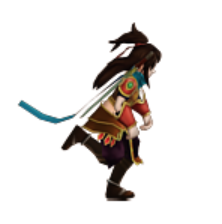
多组动画: 使用animation属性给一个元素添加多个动画效果
- 思考: 现在小人可以原地跑了, 如果想让小人跑远一些,该如何实现?
- 答: 精灵动画的同时添加盒子位移动画
- 语法
- 示例
<!DOCTYPE html>
<html lang="en">

<head>
  <meta charset="UTF-8">
  <title>精灵动画</title>
  <style>
    .box {
      /* 1680/12 : 保证显示区域的尺寸和一个精灵小图的尺寸相同 */
      width: 140px;
      height: 140px;
      background-image: url(./images/bg.png);

      /* 12: 净零小图的个数 */
      animation:
        move 1s steps(12) infinite,
        run 1s forwards;
    }


    @keyframes move {
      to {
        /* 1680: 精灵图的宽度 */
        background-position: -1680px 0;
      }
    }

    /* 定义一个盒子移动的动画  800px */
    @keyframes run {
      to {
        transform: translateX(800px);
      }
    }
  </style>
</head>

<body>
  <div class="box"></div>
</body>

</html>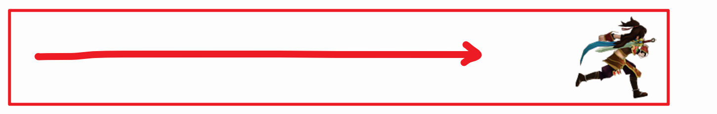
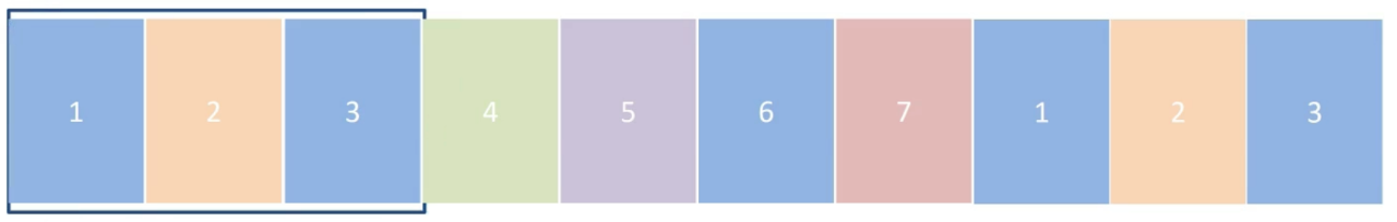
无缝动画
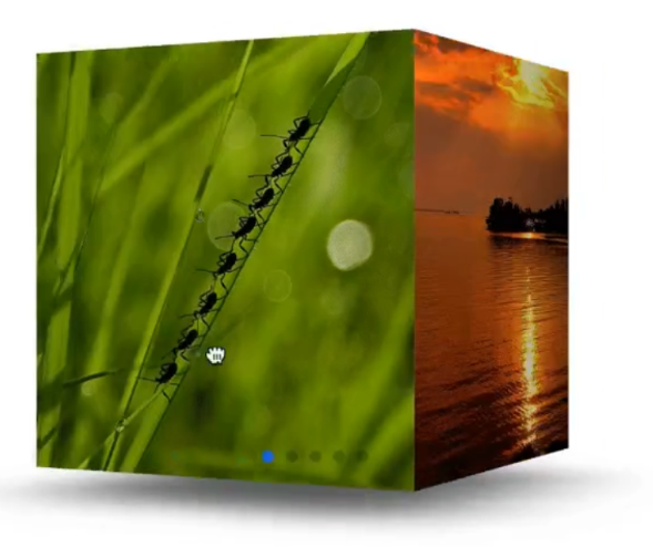
使用animation实现逐帧图片位移效果(走马灯)
- 核心原理:
- 窗口展示3张图, 就把列表的前3张图复制到列表最后,
- 当列表滚动到最后时, 展示的内容与列表最前的内容一致, 就形成视觉差, 感觉整个列表是连贯的
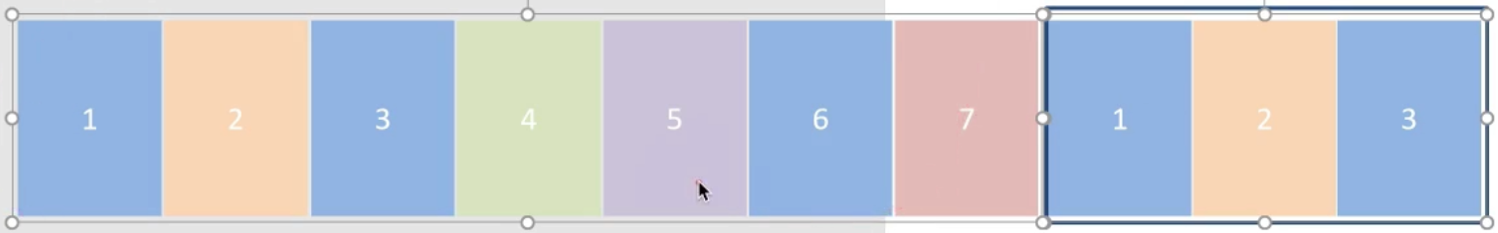
- 代码实现
<!DOCTYPE html>
<html lang="en">
  <head>
    <meta charset="UTF-8" />
    <meta name="viewport" content="width=device-width, initial-scale=1.0" />
    <title>Document</title>
    <style>
      * {
        padding: 0;
        margin: 0;
      }
      li {
        list-style: none;
      }

      img {
        width: 200px;
      }

      .box {
        width: 600px;
        height: 112px;
        border: 5px solid #000;
        margin: 100px auto;
        overflow: hidden;
      }

      .box ul {
        width: 2000px;
        animation: move 5s infinite linear;
      }

      .box li {
        float: left;
      }

      /* 定义动画:位移, ul 左侧使用  x -1400  */
      @keyframes move {
        to {
          transform: translateX(-1400px);
        }
      }

      /* 用户鼠标移入box,动画暂停 */
      .box:hover ul {
        animation-play-state: paused;
      }

    </style>
  </head>
  <body>
    <div class="box">
      <ul>
        <li><img src="./images/1.jpg" alt="" /></li>
        <li><img src="./images/2.jpg" alt="" /></li>
        <li><img src="./images/3.jpg" alt="" /></li>
        <li><img src="./images/4.jpg" alt="" /></li>
        <li><img src="./images/5.jpg" alt="" /></li>
        <li><img src="./images/6.jpg" alt="" /></li>
        <li><img src="./images/7.jpg" alt="" /></li>

        <!-- 第567移动的时候,显示区域不能留白 -->
        <li><img src="./images/1.jpg" alt="" /></li>
        <li><img src="./images/2.jpg" alt="" /></li>
        <li><img src="./images/3.jpg" alt="" /></li>
      </ul>
    </div>
  </body>
</html>
动画库
wordPress 前端+后台模板
fullPage 全屏滚动
Animate.css 让滚动更有趣
动画库的使用:
a