一、什么是CSS3过渡
CSS3 过渡(transitions)是一种效果,它允许你平滑地改变CSS属性的值,从一个状态过渡到另一个状态。是一种动画转换的过程,如渐现、渐弱、动画快慢等。过渡效果可以在用户与页面进行交互时触发,比如鼠标悬停、点击等。
语法:
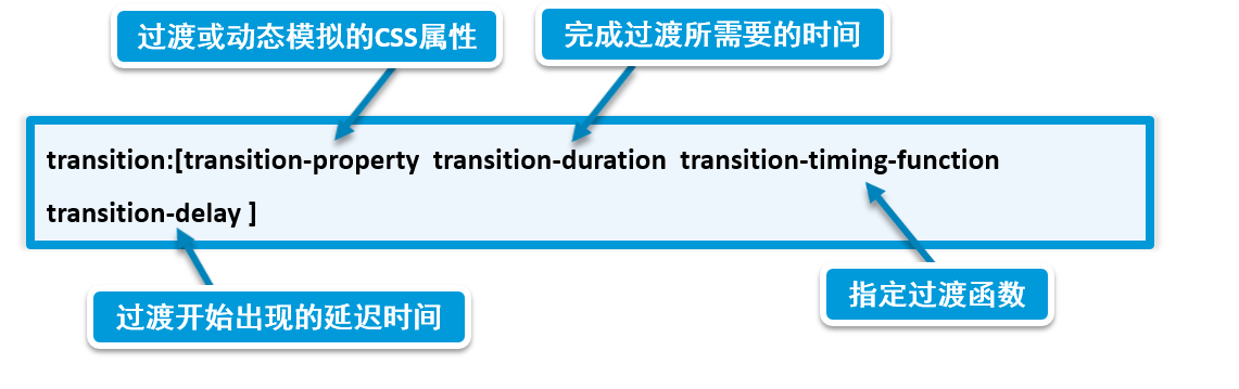
二、CSS3过渡动画(Transition)属性
| 属性名 | 作用描述 | 可选值示例 | 默认值 |
|---|---|---|---|
transition-property |
指定哪些CSS属性应用过渡效果 | all(所有属性)、width、opacity等 |
all |
transition-duration |
过渡动画持续时间 | 2s(秒)、500ms(毫秒) |
0s |
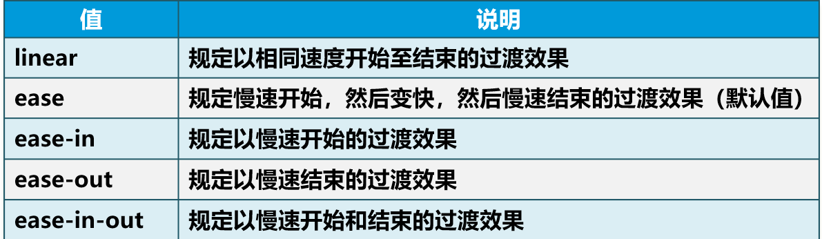
transition-timing-function |
定义动画速度曲线(加速度效果) | ease、linear、ease-in、ease-out、ease-in-out、cubic-bezier() |
ease |
transition-delay |
动画开始前的延迟时间 | 1s、200ms |
0s |
| 简写属性 | |||
transition |
合并上述属性(顺序:property duration timing-function delay) | width 1s ease-in-out 0.5s、all 0.3s linear |
无 |
注意:
三、 过渡应用
1、多属性联合过渡
<!DOCTYPE html>
<html lang="en">
<head>
    <meta charset="UTF-8">
    <title>Title</title>
  <style>
    body{
      display:flex;
      justify-content: center;
      align-items: center;
    }
    .btn {
      padding: 12px 24px;
      background-color: #4CAF50;  /* 初始背景色 */
      color: white;
      border: none;
      border-radius: 4px;
      transition: background-color 0.3s ease, transform 0.3s;  /* 简写属性 */
      /*transition: all 0.4s ease-in-out;*/
    }
    .btn:hover {
      background-color: #ac6fb3;  /* 悬停时背景色过渡 */
      transform: scale(1.05) skewX(-5deg);     /* 悬停时轻微放大,倾斜-5度 */
      box-shadow:  8px 8px 16px black;  /* 阴影加深 */
    }
  </style>


</head>
<body>
<button class="btn">点击按钮</button>
</body>
</html>
2、气泡浮动动画
<!DOCTYPE html>
<html lang="en">
<head>
    <meta charset="UTF-8">
    <title>Title</title>
    <style>
        body{
            margin: 0 auto;
            padding: 100px;
        }
        .bubble {
            width: 50px;
            height: 50px;
            background: #bd3838;
            border-radius: 50%;
            transition: background-color 0.3s , transform 1s cubic-bezier(0.25, 0.1, 0.25, 1); /* 贝塞尔曲线 */
        }

        .bubble:hover {
            background-color: #9356dc; /* 悬停时改变背景颜色 */
            transform: translateY(-20px); /* 悬停时上移 */
        }
    </style>


</head>
<body>
<div class="bubble"></div>
</body>
</html>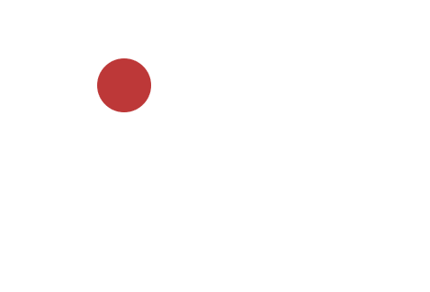
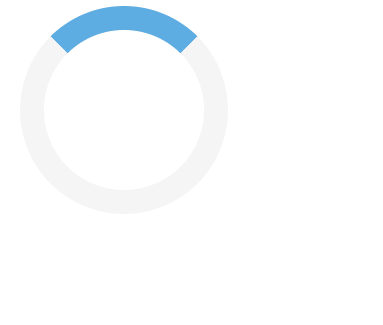
3、加载状态提示
<!DOCTYPE html>
<html lang="en">
<head>
    <meta charset="UTF-8">
    <title>Title</title>
    <style>
        .loader {
            width: 40px;
            height: 40px;
            border-radius: 50%;
            border: 6px solid #f3f3f3; /* 边框颜色 */
            border-top: 6px solid #3498db; /* 顶部边框颜色 */
            opacity: 0.8; /* 透明度 */
            transition: transform 1s linear, opacity 0.5s ease;  /* 多属性独立过渡 */
        }
        .loader:hover {
            transform: rotate(360deg);  /* 悬停时旋转一周 */
            opacity: 1; /* 悬停时完全不透明 */
        }
    </style>

</head>
<body>
<div class="loader"></div>
</body>
</html>