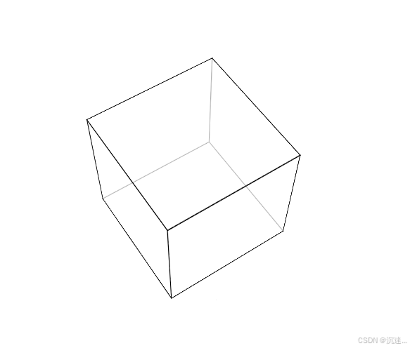
效果
<!DOCTYPE html>
<html lang="en">
<head>
<meta charset="UTF-8">
<meta name="viewport" content="width=device-width, initial-scale=1.0">
<title>Document</title>
<style>
body {
margin: 0;
height: 100vh;
display: flex;
justify-content: center;
align-items: center;
perspective: 1000px;
}
section {
width: 200px;
height: 200px;
position: relative;
transform-style: preserve-3d;
animation: rotate 5s linear infinite;
}
.box1, .box2, .box3, .box4, .box5, .box6 {
width: 100%;
height: 100%;
position: absolute;
background-color: rgba(255, 255, 255, 0.5);
border: 1px solid #000;
}
.box1 {
transform: translateZ(100px);
}
.box2 {
transform: rotateY(90deg) translateZ(100px);
}
.box3 {
transform: rotateY(180deg) translateZ(100px);
}
.box4 {
transform: rotateY(-90deg) translateZ(100px);
}
.box5 {
transform: rotateX(90deg) translateZ(100px);
}
.box6 {
transform: rotateX(-90deg) translateZ(100px);
}
@keyframes rotate {
0% {
transform: rotateX(0deg) rotateY(0deg);
}
100% {
transform: rotateX(360deg) rotateY(360deg);
}
}
</style>
</head>
<body>
<section>
<div class="box1"></div>
<div class="box2"></div>
<div class="box3"></div>
<div class="box4"></div>
<div class="box5"></div>
<div class="box6"></div>
</section>
</body>
</html>