1. Overview
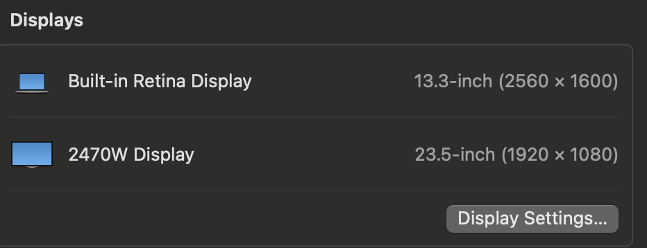
1.1 Physical Pixels ( Display Resolution )
| Display | Physical Resolution | CSS Pixels (Approx) | devicePixelRatio | Scaling |
|---|---|---|---|---|
| MacBook Retina | 2560 × 1600 | 2 | Yes | |
| External 2470W | 1920 × 1080 | 1920 × 1080 | 1 | No |
% system_profiler SPDisplaysDataType

Graphics/Displays:

    Apple M1:

      Chipset Model: Apple M1
      Type: GPU
      Bus: Built-In
      Total Number of Cores: 7
      Vendor: Apple (0x106b)
      Metal Support: Metal 3
      Displays:
        Color LCD:
          Display Type: Built-In Retina LCD
          Resolution: 2560 x 1600 Retina
          Main Display: Yes
          Mirror: Off
          Online: Yes
          Automatically Adjust Brightness: Yes
          Connection Type: Internal
        2470W:
          Resolution: 1920 x 1080 (1080p FHD - Full High Definition)
          UI Looks like: 1920 x 1080 @ 60.00Hz
          Mirror: Off
          Online: Yes
          Rotation: Supported
1.2 CSS Pixels and devicePixelRatio ( What Browser See)
# Extended Display
window.innerHeight
992
window.innerWidth
1288
window.outerHeight
992
window.outerWidth
1920
window.devicePixelRatio
1
# Built-in Display (Macbook)
window.innerHeight
812
window.outerHeight
812
window.innerWidth
783
window.outerWidth
1440
window.devicePixelRatio
2
screen.width
1920
screen.height
1080
screen.availHeight
1080
screen.availWidth
1920
screen.width
1440
screen.height
900
screen.availHeight
900
screen.availWidth
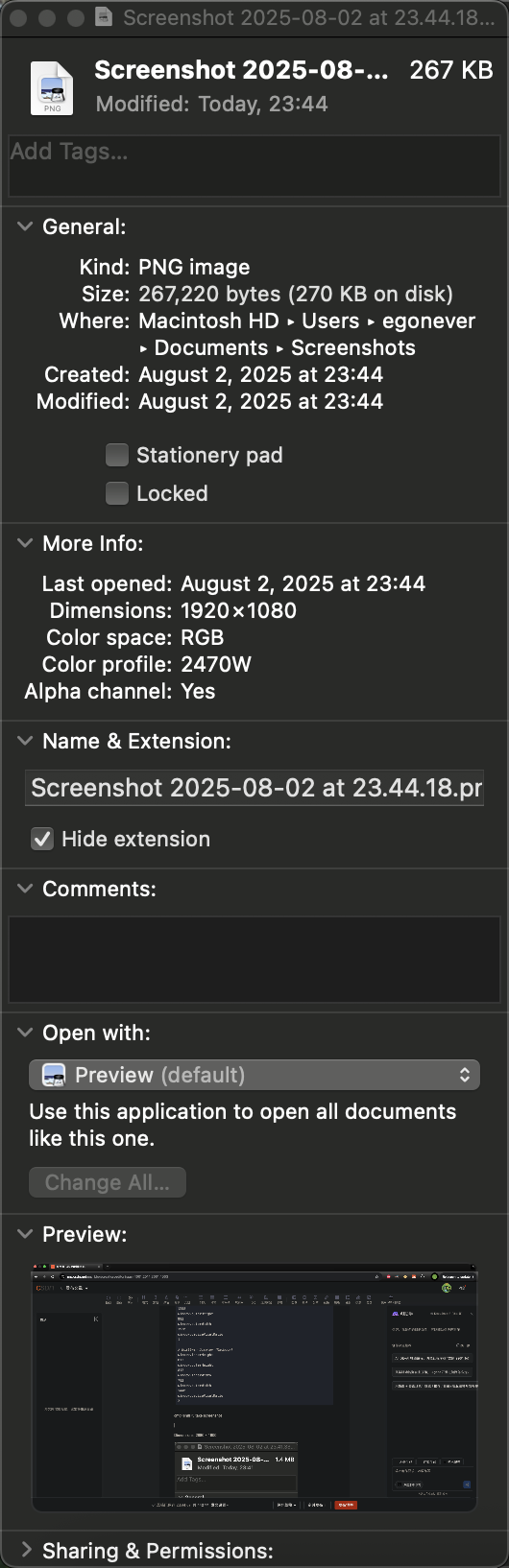
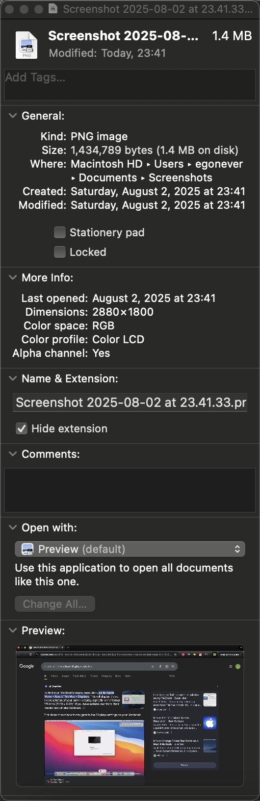
14401.3 CMD+SHIFT+5 take screenshot
Dimensions: 1920 × 1080
Dimensions: 2880 × 1800
Why Use 1280 × 800 in Demos?
Baseline Reference: 1280 × 800 is the default scaled resolution macOS uses for Retina displays to balance clarity and layout space.
Design Compatibility: Many designers use it as a safe minimum for responsive layouts.
Predictable Ratio: It maps cleanly to 2560 × 1600 with a
devicePixelRatioof 2.
But for real-world dev work, especially when you're optimizing layouts or srcset breakpoints, using your actual CSS pixel dimensions (1440 × 812) is far more accurate.
Correct Breakdown for 13" MacBook Pro Retina
| Attribute | Value |
|---|---|
| Physical Resolution | 2560 × 1600 px |
| Default CSS Resolution | 1280 × 800 CSS px (scaled) |
| devicePixelRatio | 2 |
| Effective Layout Space | ~1440 × 812 CSS px (browser window) |
So when you're seeing 1440 × 812, it's likely because your display is set to a scaled resolution of 1440 × 900, which gives you more screen real estate while still rendering at Retina sharpness.
2. CSS Pixels vs Physical Pixels: visual comparison
╔══════════════════════════════════════════════════════════════════════════╗
║                            MacBook Retina Display                       ║
║                          Native: 2560 × 1600 px                         ║
║                          devicePixelRatio: 2                            ║
╚══════════════════════════════════════════════════════════════════════════╝

CSS Pixel Grid (Logical Layout Space):
┌────────────────────────────────────────────┐
│                                            │
│         1280 CSS px × 800 CSS px           │
│                                            │
└────────────────────────────────────────────┘

Each CSS pixel = 2 × 2 physical pixels
→ Rendered using 2560 × 1600 physical pixels
→ Crisp visuals, Retina sharpness

Example:
<img width="100"> → occupies 100 CSS px → rendered as 200 physical px wide


╔══════════════════════════════════════════════════════════════════════════╗
║                          External Display: 2470W                        ║
║                          Native: 1920 × 1080 px                         ║
║                          devicePixelRatio: 1                            ║
╚══════════════════════════════════════════════════════════════════════════╝

CSS Pixel Grid:
┌────────────────────────────────────────────┐
│                                            │
│         1920 CSS px × 1080 CSS px          │
│                                            │
└────────────────────────────────────────────┘

Each CSS pixel = 1 × 1 physical pixel
→ No scaling
→ Standard sharpness

Example:
<img width="100"> → occupies 100 CSS px → rendered as 100 physical px wide
📐 Retina Display Mapping: 13" vs 13.3"
| MacBook Model | Physical Resolution | Common Scaled CSS Resolution | devicePixelRatio | Notes |
|---|---|---|---|---|
| 13-inch Retina | 2560 × 1600 | 1280 × 800 | 2 | Classic Retina scaling |
| 13.3-inch Retina | 2880 × 1624 | 1440 × 812 (approx) | 2 | Newer MacBooks (e.g. M1/M2 Air) |
🧠 How CSS Pixels Map Cleanly
1280 × 800 CSS px → 2560 × 1600 physical px (2× scaling)
1440 × 812 CSS px → 2880 × 1624 physical px (2× scaling)
This clean 2× mapping ensures:
Crisp rendering of text and UI
Predictable layout space for web design
Retina-quality visuals without distortion
🎯 Design Implications
When designing for Retina, always think in CSS pixels.
Use
devicePixelRatioto serve high-res images viasrcsetor<picture>.Test layouts at 1280px and 1440px breakpoints to ensure compatibility across both Retina classes.
3. How devicePixelRatio Is Calculated
1. Definition
devicePixelRatio is the ratio of physical pixels to CSS pixels on a display:
js
devicePixelRatio = physical pixels / CSS pixels
For example:
A standard display with 96 DPI:
devicePixelRatio = 1A Retina display with 192 DPI:
devicePixelRatio = 2
2. Browser Behavior
Browsers use the screen’s actual pixel density and default DPI (usually 96) to compute this ratio.
They expose it via
window.devicePixelRatio, which is a floating-point number (e.g., 1.25, 2, 3).
You can check it with:
js
console.log(window.devicePixelRatio);
3. Factors That Influence It
Display DPI: Higher DPI means more physical pixels per inch.
Zoom Level: Page zooming affects
devicePixelRatiobecause it changes the size of a CSS pixel.Display Switching: Dragging a browser window to a monitor with different DPI can change the value dynamically.
Pinch Zooming: Does not affect
devicePixelRatio, since it magnifies the page without altering CSS pixel size.
4. Why It Matters
It helps browsers render crisp images and text on high-DPI screens.
Developers use it to serve higher-resolution assets (e.g.,
@2ximages).It affects canvas rendering, media queries, and responsive design.
4. How Browsers Know the Screen’s Pixel Density
1. Operating System APIs
Browsers query the OS for:
Physical resolution (e.g., 2880 × 1800)
Logical resolution (e.g., 1440 × 900)
Screen DPI settings (dots per inch)
These values are provided by the device’s graphics subsystem and firmware.
2. Default CSS Pixel Grid
Browsers assume a baseline of 96 DPI for CSS pixels. This means:
1 CSS pixel ≈ 1/96 inch
If the screen has 192 DPI, then
devicePixelRatio = 2
3. devicePixelRatio Calculation
Browsers compute:
js
devicePixelRatio = physical pixels / CSS pixels
This value is exposed via:
js
window.devicePixelRatio
It dynamically updates if:
You zoom the page
You move the window to a different monitor
The OS changes display scaling
4. Limitations
Browsers don’t directly expose physical screen size or DPI in inches.
There’s no standard JavaScript API for exact physical dimensions (like
window.screenDensity), though developers have long requested it.Native apps have more access to this data than web apps.
5. What Is Display Scaling?
Display scaling is a feature in operating systems like Windows and macOS that:
Increases the size of interface elements without lowering screen resolution
Makes content readable on high-DPI displays (e.g. 4K or Retina)
Prevents UI elements from appearing tiny due to high pixel density
📐 Example: Windows Display Scaling
Let’s say your laptop has a 3840 × 2160 (4K) screen:
Without scaling, everything would look extremely small.
Windows might apply 150% scaling, meaning:
Text and UI elements are drawn at 1.5× their normal size
But the screen still uses the full 4K resolution for sharpness
You can adjust this manually in Settings → Display → Scale and Layout.
🍎 macOS Scaling
macOS uses a similar system but emphasizes 2× Retina scaling:
A 5120 × 2880 display might render the UI as if it were 2560 × 1440
This keeps everything sharp and readable, while still using the full resolution for rendering
🔍 Why It Affects devicePixelRatio
When the OS applies scaling:
The browser updates
devicePixelRatioto reflect the new ratio of physical pixels to CSS pixelsThis ensures web content scales appropriately
6. Why Screenshot Size Exceeds Physical Resolution
🔍 macOS HiDPI Scaling (Retina Mode)
macOS renders the UI at a higher virtual resolution than the physical screen.
Then it downscales the rendered image to fit the actual display.
This improves text sharpness and UI clarity — especially for Retina displays.
📊 Breakdown of What’s Happening
| Mode | Virtual Resolution | Physical Resolution | devicePixelRatio | Screenshot Size |
|---|---|---|---|---|
| Retina @ “Looks like 1440 × 900” | 2880 × 1800 | 2560 × 1600 | 2 | 2880 × 1800 |
“Looks like 1440 × 900” is a scaled mode.
macOS renders everything at 2× that size: 2880 × 1800.
Then it downsamples to 2560 × 1600 for display.
But screenshots capture the full virtual canvas, not the downsampled output.
🧪 How to Confirm This
You can run this in Safari’s DevTools or Chrome:
js
window.devicePixelRatio // Should return 2
screen.width            // Should return 1440
screen.height           // Should return 900
Yet your screenshots will be 2880 × 1800 — confirming the 2× scaling.
7. Python Script: macOS Display Info via pyobjc
Here’s the final version of your Retina-aware display diagnostic script. It compares:
Logical Resolution: CSS layout space (points)
Rendered Resolution: Framebuffer size used by macOS
Native Panel Resolution: From
system_profiler(accurate for internal displays)EDID Resolution: From
ioreg(accurate for external monitors)Physical Size: From Quartz
DPI: Based on native panel resolution
import subprocess
import re
from AppKit import NSScreen
from Quartz import CGDisplayScreenSize, CGMainDisplayID

def get_edid_resolution():
    try:
        ioreg_output = subprocess.check_output(["ioreg", "-l"], text=True)
        edid_blocks = re.findall(r"<([0-9a-fA-F]{256})>", ioreg_output)

        for edid_hex in edid_blocks:
            edid_bytes = bytes.fromhex(edid_hex)
            h_active = edid_bytes[56] + ((edid_bytes[58] & 0xF0) << 4)
            v_active = edid_bytes[59] + ((edid_bytes[61] & 0xF0) << 4)
            if h_active > 0 and v_active > 0:
                return (h_active, v_active)
    except Exception as e:
        print(f"EDID parsing failed: {e}")
    return None

def get_native_resolution_from_system_profiler():
    try:
        output = subprocess.check_output(
            ["system_profiler", "SPDisplaysDataType"],
            text=True
        )
        match = re.search(r"Resolution:\s*(\d+)\s*x\s*(\d+)", output)
        if match:
            return int(match.group(1)), int(match.group(2))
    except Exception as e:
        print(f"system_profiler failed: {e}")
    return None

def get_display_info():
    screen = NSScreen.mainScreen()
    frame = screen.frame()
    scale = screen.backingScaleFactor()

    # Logical resolution
    logical_width = int(frame.size.width)
    logical_height = int(frame.size.height)

    # Rendered resolution
    pixel_frame = screen.convertRectToBacking_(frame)
    rendered_width = int(pixel_frame.size.width)
    rendered_height = int(pixel_frame.size.height)

    # Native panel resolution from system_profiler
    native_resolution = get_native_resolution_from_system_profiler()

    # EDID resolution
    edid_resolution = get_edid_resolution()

    # Physical size
    display_id = CGMainDisplayID()
    size_mm = CGDisplayScreenSize(display_id)
    width_mm = size_mm.width
    height_mm = size_mm.height

    # DPI based on native resolution
    panel_width, panel_height = native_resolution if native_resolution else (rendered_width, rendered_height)
    dpi_x = panel_width / (width_mm / 25.4)
    dpi_y = panel_height / (height_mm / 25.4)

    return {
        "Logical Resolution": f"{logical_width} × {logical_height}",
        "Rendered Resolution (Framebuffer)": f"{rendered_width} × {rendered_height}",
        "Native Panel Resolution (system_profiler)": f"{panel_width} × {panel_height}",
        "EDID Resolution (ioreg)": f"{edid_resolution[0]} × {edid_resolution[1]}" if edid_resolution else "Unavailable",
        "Backing Scale Factor": scale,
        "Physical Size (mm)": f"{width_mm:.2f} × {height_mm:.2f}",
        "DPI (Based on Native Panel)": f"{dpi_x:.2f} × {dpi_y:.2f}"
    }

if __name__ == "__main__":
    info = get_display_info()
    for key, value in info.items():
        print(f"{key}: {value}")
% python -m envato.utils.displays
Logical Resolution: 1440 × 900
Rendered Resolution (Framebuffer): 2880 × 1800
Native Panel Resolution (system_profiler): 2560 × 1600
EDID Resolution (ioreg): Unavailable
Backing Scale Factor: 2.0
Physical Size (mm): 286.87 × 179.29
DPI (Based on Native Panel): 226.67 × 226.67