二维可视化
散点图
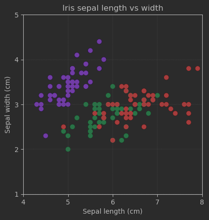
matplotlib绘图
import matplotlib.pyplot as plt
from sklearn.datasets import load_iris
import numpy as np

# 加载鸢尾花数据集
iris = load_iris()

# 提取花萼长度和花萼宽度作为变量
sepal_length = iris.data[:, 0]
sepal_width = iris.data[:, 1]
target = iris.target

fig, ax = plt.subplots()

# 创建散点图
plt.scatter(sepal_length, sepal_width, c=target, cmap='rainbow')

# 添加标题和轴标签
plt.title('Iris sepal length vs width')
plt.xlabel('Sepal length (cm)')
plt.ylabel('Sepal width (cm)')

# 设置横纵轴刻度
ax.set_xticks(np.arange(4, 8 + 1, step=1))
ax.set_yticks(np.arange(1, 5 + 1, step=1))

# 设定横纵轴尺度1:1
ax.axis('scaled')

# 增加刻度网格,颜色为浅灰
ax.grid(linestyle='--', linewidth=0.25, color=[0.7,0.7,0.7])

# 设置横纵轴范围
ax.set_xbound(lower = 4, upper = 8)
ax.set_ybound(lower = 1, upper = 5)

# 显示图形
plt.show()
显示效果:
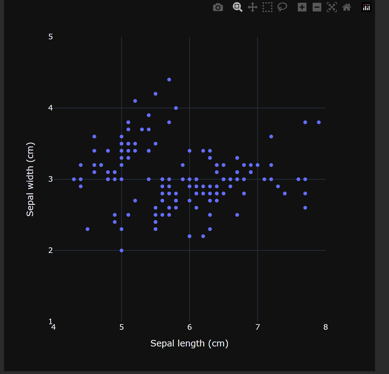
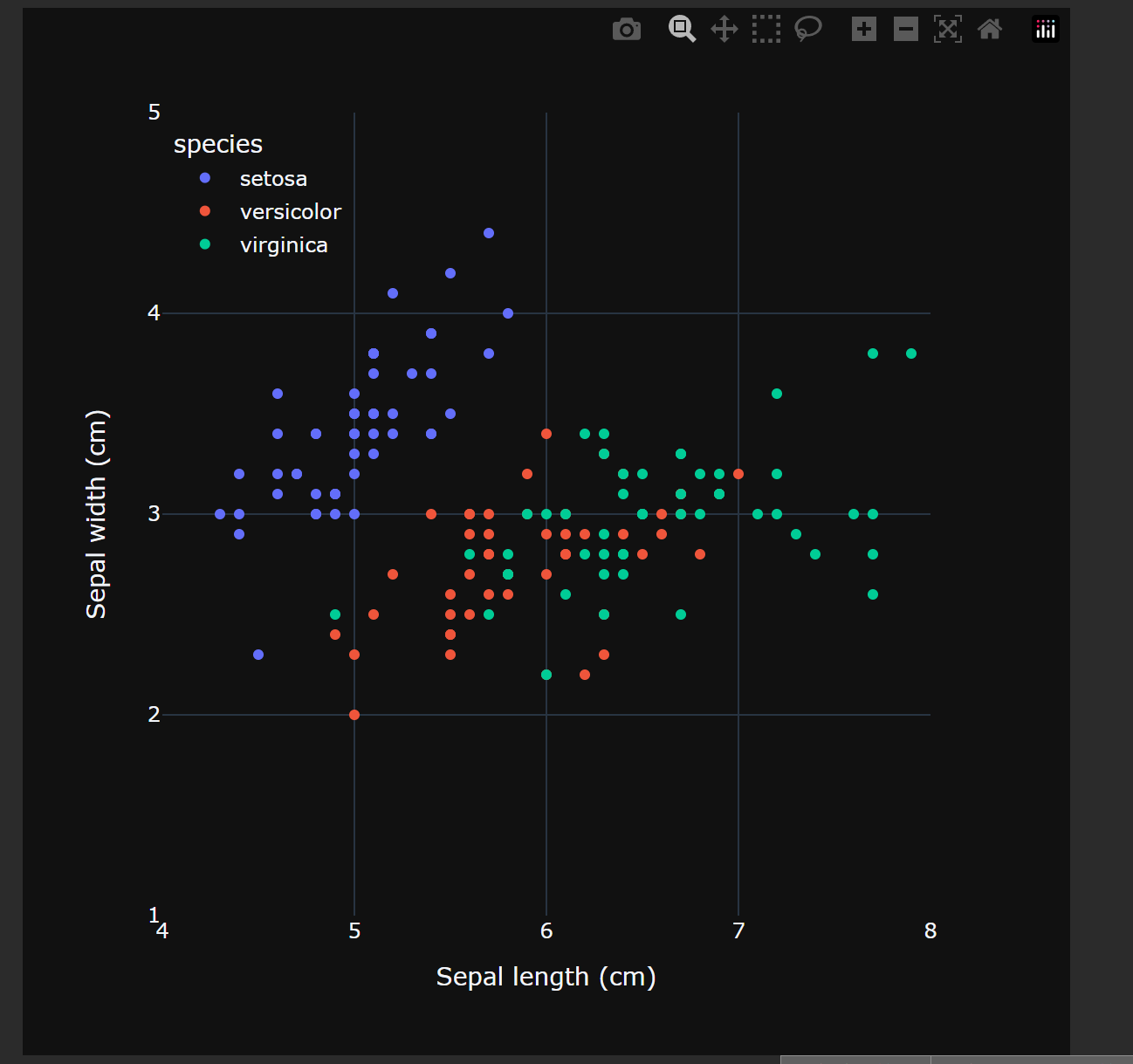
Plotly绘图
# 导入包
import numpy as np
import plotly.express as px

# 从Ploly中导入鸢尾花样本数据
iris_df = px.data.iris()

# 绘制散点图,不渲染marker
fig = px.scatter(iris_df, x="sepal_length", y="sepal_width",
                 width = 600, height = 600,
                 labels={"sepal_length": "Sepal length (cm)",
                         "sepal_width":  "Sepal width (cm)"})
# 修饰图像
# 设置横纵坐标轴范围
fig.update_layout(xaxis_range=[4, 8], yaxis_range=[1, 5])
xticks = np.arange(4,8+1)
yticks = np.arange(1,5+1)
# 设置刻度,tickmode是设置模式
fig.update_layout(xaxis = dict(tickmode = 'array',
                               tickvals = xticks))
fig.update_layout(yaxis = dict(tickmode = 'array',
                               tickvals = yticks))
fig.show()

# 绘制散点图,渲染marker展示鸢尾花分类
fig = px.scatter(iris_df, x="sepal_length", y="sepal_width",
                 color="species",
                 width = 600, height = 600,
                 labels={"sepal_length": "Sepal length (cm)",
                         "sepal_width": "Sepal width (cm)"})
# 修饰图像
fig.update_layout(xaxis_range=[4, 8], yaxis_range=[1, 5])
fig.update_layout(xaxis = dict(tickmode = 'array',
                               tickvals = xticks))
fig.update_layout(yaxis = dict(tickmode = 'array',
                               tickvals = yticks))
# 这里是设置图例,按图例上端与左端到坐标轴距离占图像百分比设置锚点,固定位置
fig.update_layout(legend=dict(yanchor="top", y=0.99,
                              xanchor="left",x=0.01))
fig.show()
图示效果:
数据集的导入
鸢尾花数据三个不同途径:
sklearn.datasets.load_iris()。导入的格式是NumPy Array
seaborn.load_dataset(“iris”) 和 plotly.express.data.iris() 导入的都是Pandas DataFrame类型,但在一些定义上略有不同。
等高线
网格数据
将二维数据通过复制的方式变成矩阵,适合生成等高线
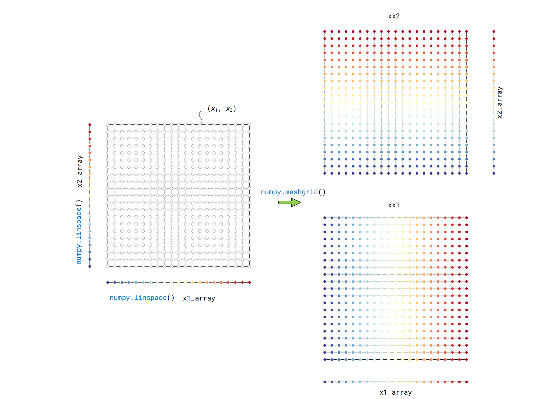
生成网格数据的函数为:
xx1, xx2 = numpy.meshgrid(x1, x2)
matplotlib生成
# 导入包
import numpy as np
import matplotlib.pyplot as plt
# 生成数据
x1_array = np.linspace(-3,3,121)
x2_array = np.linspace(-3,3,121)
# 生成网格数据
xx1, xx2 = np.meshgrid(x1_array, x2_array)
ff = xx1 * np.exp(- xx1**2 - xx2 **2)
# 等高线
fig, ax = plt.subplots()
# 生成等高线对象
CS = ax.contour(xx1, xx2, ff, levels = 20,
cmap = 'RdYlBu_r', linewidths = 1)
fig.colorbar(CS) # 上色
ax.set_xlabel('$\it{x_1}$'); ax.set_ylabel('$\it{x_2}$')
ax.set_xticks([]); ax.set_yticks([]) # 消除刻度线
ax.set_xlim(xx1.min(), xx1.max()) # 设置坐标轴限制
ax.set_ylim(xx2.min(), xx2.max())
ax.grid(False) # 取消网格
ax.set_aspect('equal', adjustable='box') # 设置比例
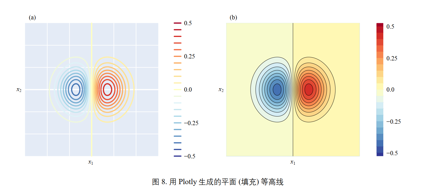
# 填充等高线
fig, ax = plt.subplots()
CS = ax.contourf(xx1, xx2, ff, levels = 20, # 填充等高线函数
cmap = 'RdYlBu_r')
fig.colorbar(CS)
ax.set_xlabel('$\it{x_1}$'); ax.set_ylabel('$\it{x_2}$')
ax.set_xticks([]); ax.set_yticks([])
ax.set_xlim(xx1.min(), xx1.max())
ax.set_ylim(xx2.min(), xx2.max())
ax.grid(False)
ax.set_aspect('equal', adjustable='box')
效果:
用Plotly生成
# 导入包
import numpy as np
import matplotlib.pyplot as plt
import plotly.graph_objects as go
# 生成数据
x1_array = np.linspace(-3,3,121)
x2_array = np.linspace(-3,3,121)
xx1, xx2 = np.meshgrid(x1_array, x2_array)
ff = xx1 * np.exp(- xx1**2 - xx2 **2)
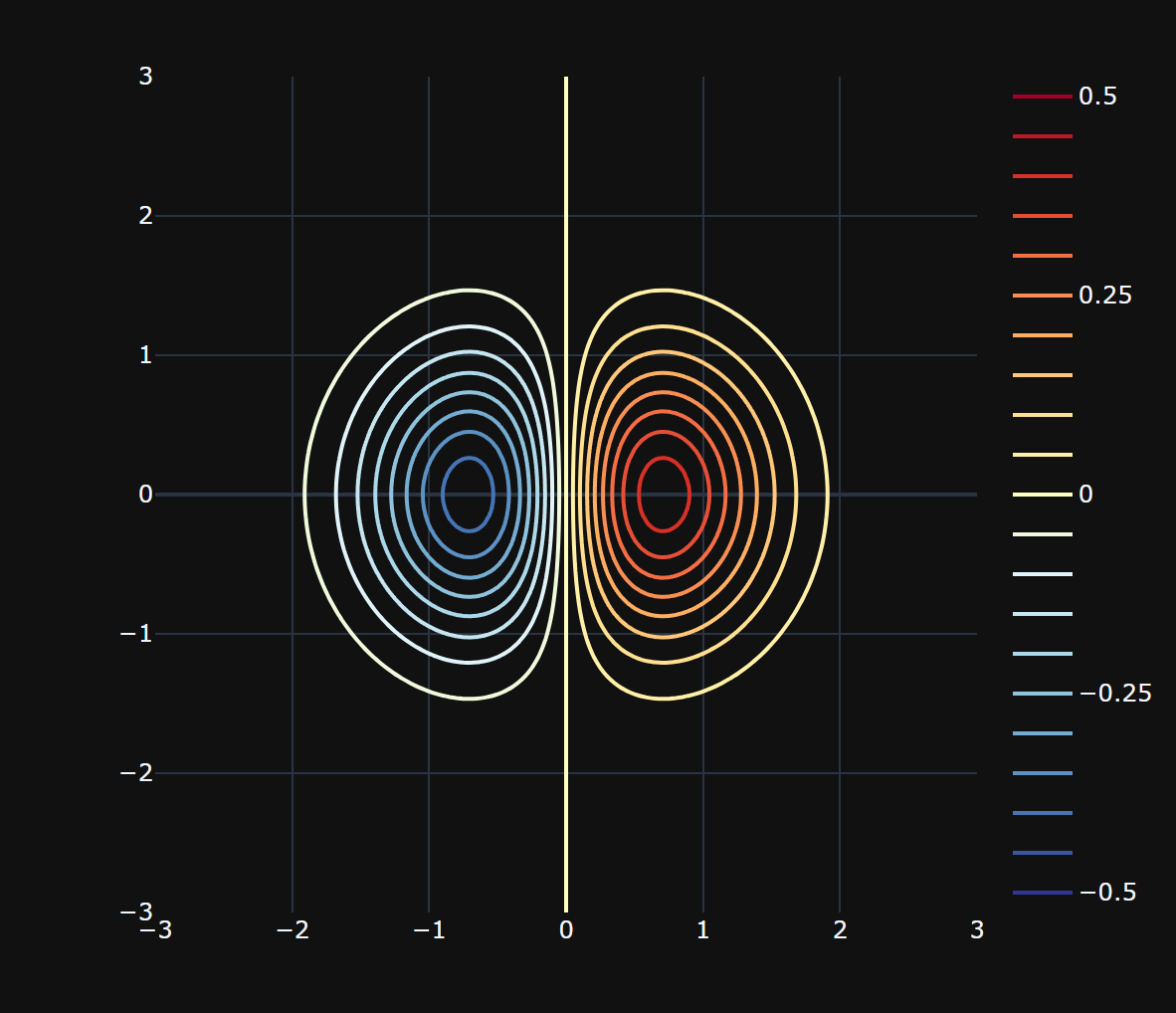
# 等高线设置
levels = dict(start=-0.5,end=0.5,size=0.05) # 等高线参数
data = go.Contour(x=x1_array,y=x2_array,z=ff,
contours_coloring='lines', # 线条着色
line_width=2,
colorscale = 'RdYlBu_r',
contours=levels) # 设置参数
# 创建布局
layout = go.Layout(
width=600, # 设置图形宽度
height=600, # 设置图形高度
xaxis=dict(title=r'$x_1$'),
yaxis=dict(title=r'$x_2$'))
# 创建图形对象
fig = go.Figure(data=data, layout=layout)
fig.show()
效果:
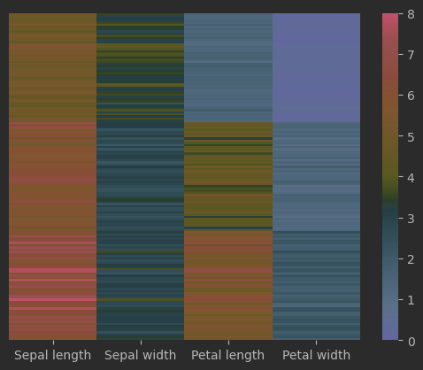
热图
将矩阵中数值的大小映射成颜色
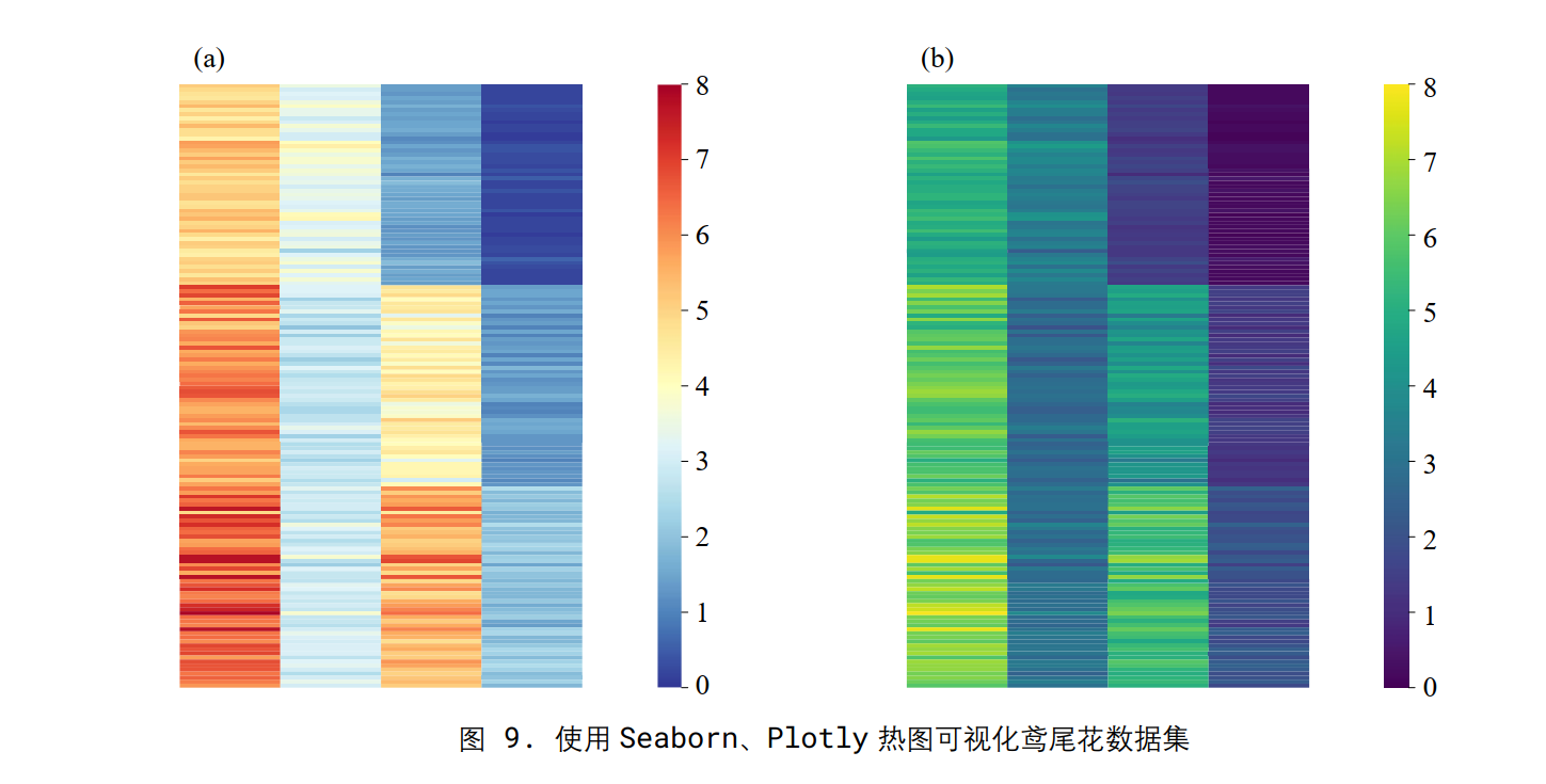
使用seaborn实现
import matplotlib.pyplot as plt
import seaborn as sns

# 从seaborn中导入鸢尾花样本数据
iris_sns = sns.load_dataset("iris")

# 绘制热图
fig, ax = plt.subplots()

sns.heatmap(data=iris_sns.iloc[:,0:-1],				# 取除去最后一列数据
            vmin = 0, vmax = 8,						# 颜色映射范围
            ax = ax,
            yticklabels = False,
            xticklabels = ['Sepal length', 'Sepal width',
                           'Petal length', 'Petal width'],
            cmap = 'RdYlBu_r')
效果:
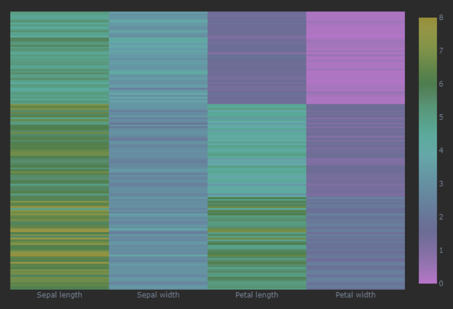
使用Plotly生成
# 导入包
import matplotlib.pyplot as plt
import plotly.express as px

# 从Plotly中导入鸢尾花样本数据
df = px.data.iris()

# 创建Plotly热图
fig = px.imshow(df.iloc[:,0:-2],
text_auto=False,						# 禁用文本自动生成
width = 600, height = 600,
x = None, zmin=0, zmax=8,				# x轴不显示具体数值,设置颜色映射范围
color_continuous_scale = 'viridis')		#

# 隐藏 y 轴刻度标签
fig.update_layout(						# 更新图像布局
yaxis=dict(tickmode='array',tickvals=[]))	# y轴不显示刻度

# 修改 x 轴刻度标签
x_labels = ['Sepal length', 'Sepal width',
'Petal length', 'Petal width']
x_ticks = list(range(len(x_labels)))
fig.update_xaxes(tickmode='array',tickvals=x_ticks,	# 更新横轴
ticktext=x_labels)
fig.show()
效果
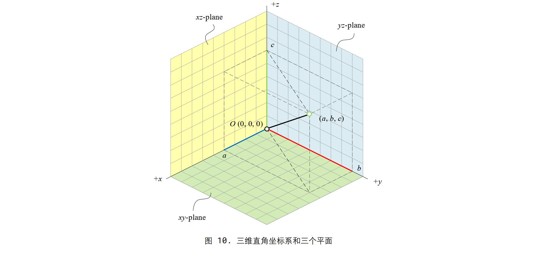
三维可视化
import matplotlib.pyplot as plt
fig = plt.figure()
# 创建一个新的图形窗口
ax = fig.add_subplot(projection='3d')
# 在图形窗口中添加一个3D坐标轴子图
ax.set_xlabel('x')
ax.set_ylabel('y')
ax.set_zlabel('z')
# 设置坐标轴的标签
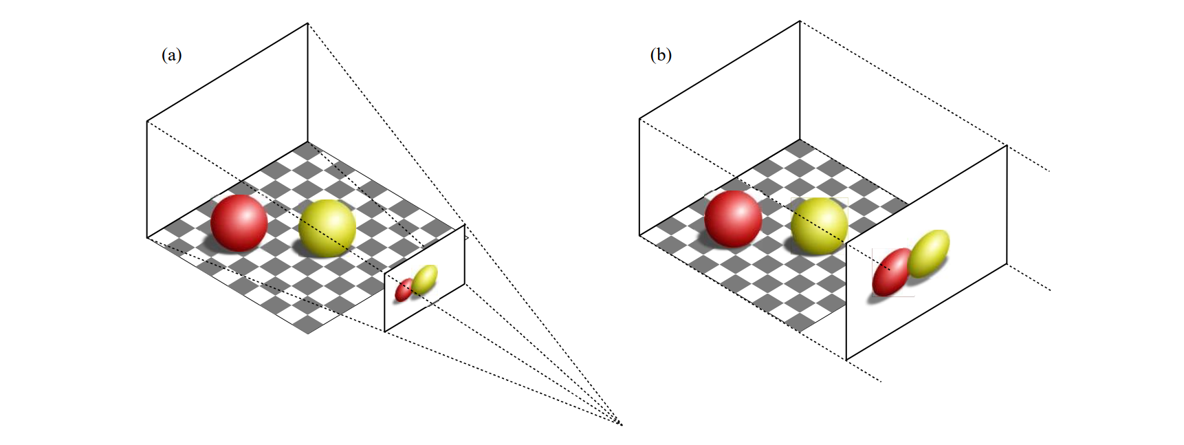
ax.set_proj_type('ortho')
# 设置投影类型为正交投影 (orthographic projection)
ax.view_init(elev=30, azim=30)
# 设置观察者的仰角为30度,方位角为30度,即改变三维图形的视角
ax.set_box_aspect([1,1,1])
# 设置三个坐标轴的比例一致,使得图形在三个方向上等比例显示
plt.show()
效果:
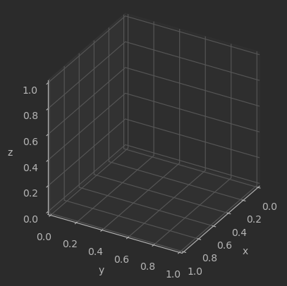
这里注意,这里的摄像机参数如下所示:

仰角 (elevation): elev 参数定义了观察者与 xy 平面之间的夹角,也就是观察者与 xy 平面之间的旋转角度。当 elev 为正值时,观察者向上倾斜,负值则表示向下倾斜。
方位角 (azimuth): azim 参数定义了观察者绕 z 轴旋转的角度。它决定了观察者在 xy 平面上的位置。 azim 的角度范围是 −180 到 180 度,其中正值表示逆时针旋转,负值表示顺时针旋转。
滚动角 (roll): roll 参数定义了绕观察者视线方向旋转的角度。它决定了观察者的头部倾斜程度。正值表示向右侧倾斜, 负值表示向左侧倾斜。
这里设置的旋转角就是默认旋转角。
另外正交投影和透视投影详见我的games101笔记。
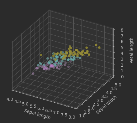
三维散点
Matplotlib
# 导入包
import matplotlib.pyplot as plt
import numpy as np
from sklearn import datasets
 # 加载鸢尾花数据集
iris = datasets.load_iris()
# 取出前三个特征作为横纵坐标和高度
X = iris.data[:, :3]
y = iris.target

# 创建3D图像对象
fig = plt.figure()
ax = fig.add_subplot(111, projection='3d')

# 绘制散点图
ax.scatter(X[:, 0], X[:, 1], X[:, 2], c=y)

# 设置坐标轴标签
ax.set_xlabel('Sepal length')
ax.set_ylabel('Sepal width')
ax.set_zlabel('Petal length')
# 设置坐标轴取值范围
ax.set_xlim(4,8); ax.set_ylim(1,5); ax.set_zlim(0,8)
# 设置正交投影
ax.set_proj_type('ortho')
# 显示图像
plt.show()
效果:
Plotly
import plotly.express as px
# 导入鸢尾花数据
df = px.data.iris()
fig = px.scatter_3d(df,
x='sepal_length',
y='sepal_width',
z='petal_length',
size = 'petal_width',
color='species')
fig.update_layout(autosize=False,width=500,height=500)
fig.layout.scene.camera.projection.type = "orthographic"
fig.show()
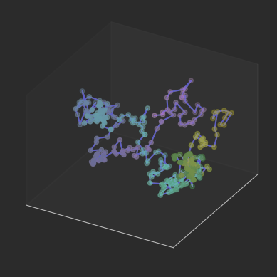
三维线图
随机步长:
matplotlib
# 导入包
import matplotlib.pyplot as plt
import numpy as np
import plotly.graph_objects as go

# 生成随机游走数据
num_steps = 300
t = np.arange(num_steps)
x = np.cumsum(np.random.standard_normal(num_steps))
y = np.cumsum(np.random.standard_normal(num_steps))
z = np.cumsum(np.random.standard_normal(num_steps))

# 用 Matplotlib 可视化
fig = plt.figure()
ax = fig.add_subplot(111, projection='3d')

ax.plot(x,y,z,color = 'darkblue')
ax.scatter(x,y,z,c = t, cmap = 'viridis')

ax.set_xticks([]); ax.set_yticks([]); ax.set_zticks([])
# 设置正交投影
ax.set_proj_type('ortho')
# 设置相机视角
ax.view_init(elev = 30, azim = 120)
# 显示图像
plt.show()
效果:
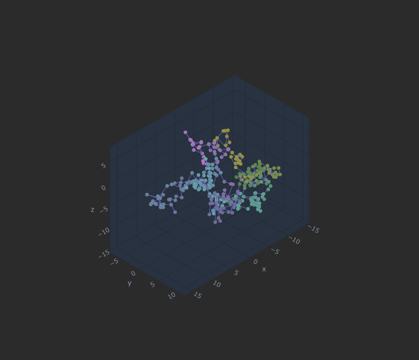
plotly
# 用 Plotly 可视化
fig = go.Figure(data=go.Scatter3d(
    x=x, y=y, z=z,
    marker=dict(size=4,color=t,colorscale='Viridis'),
    line=dict(color='darkblue', width=2)))

fig.layout.scene.camera.projection.type = "orthographic"
fig.update_layout(width=800,height=700)
fig.show()  # 显示绘图结果
效果:
三维网格
# 导入包
import matplotlib.pyplot as plt
import numpy as np
import plotly.graph_objects as go
# 生成曲面数据
x1_array = np.linspace(-3,3,121)
x2_array = np.linspace(-3,3,121)
xx1, xx2 = np.meshgrid(x1_array, x2_array)
ff = xx1 * np.exp(- xx1**2 - xx2 **2)
# 用 Matplotlib 可视化三维曲面
fig = plt.figure()
ax = fig.add_subplot(111, projection='3d')
ax.plot_surface(xx1, xx2, ff, cmap='RdYlBu_r')
# 设置坐标轴标签
ax.set_xlabel('x1'); ax.set_ylabel('x2');
ax.set_zlabel('f(x1,x2)')
# 设置坐标轴取值范围
ax.set_xlim(-3,3); ax.set_ylim(-3,3); ax.set_zlim(-0.5,0.5)
# 设置正交投影
ax.set_proj_type('ortho')
# 设置相机视角
ax.view_init(elev = 30, azim = 150)
plt.tight_layout()
plt.show()
# 用 Plotly 可视化三维曲面
fig = go.Figure(data=[go.Surface(z=ff, x=xx1, y=xx2,
colorscale='RdYlBu_r')])
fig.layout.scene.camera.projection.type = "orthographic"
fig.update_layout(width=800,height=700)
fig.show()
效果:
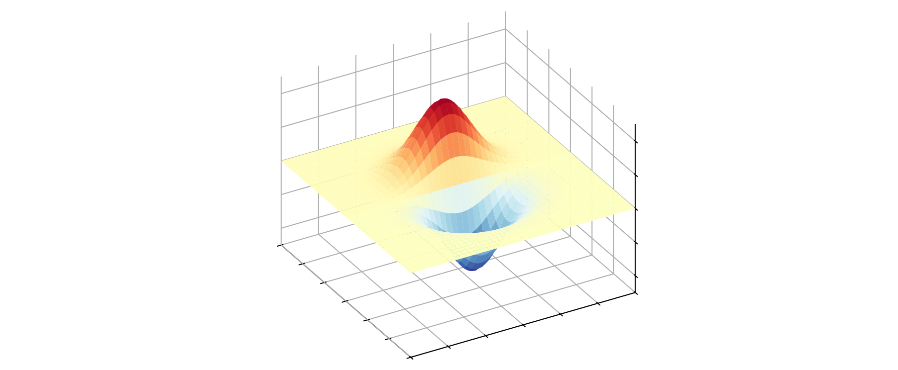
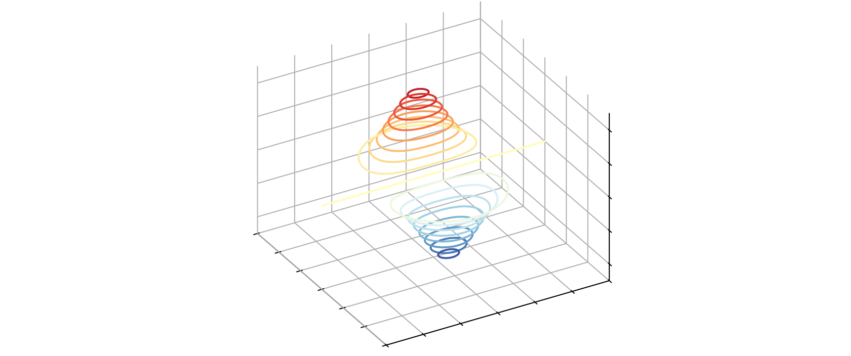
三维等高线
# 导入包
import matplotlib.pyplot as plt
import numpy as np
import plotly.graph_objects as go
# 生成曲面数据
x1_array = np.linspace(-3,3,121)
x2_array = np.linspace(-3,3,121)
xx1, xx2 = np.meshgrid(x1_array, x2_array)
ff = xx1 * np.exp(- xx1**2 - xx2 **2)
fig = plt.figure()
ax = fig.add_subplot(111, projection='3d')
ax.contour(xx1, xx2, ff, cmap='RdYlBu_r', levels = 20)
# 设置坐标轴标签
ax.set_xlabel('x1'); ax.set_ylabel('x2'); ax.set_zlabel('f(x1,x2)')
# 设置坐标轴取值范围
ax.set_xlim(-3,3); ax.set_ylim(-3,3); ax.set_zlim(-0.5,0.5)
# 设置正交投影
ax.set_proj_type('ortho')
# 设置相机视角
ax.view_init(elev = 30, azim = 150)
plt.tight_layout()
plt.show()
contour_settings = {"z": {"show":True,"start":-0.5,
"end":0.5, "size": 0.05}}
fig = go.Figure(data=[go.Surface(x=xx1,y=xx2,z=ff,
colorscale='RdYlBu_r',
contours = contour_settings)])
fig.layout.scene.camera.projection.type = "orthographic"
fig.update_layout(width=800, height=700)
fig.show() # 显示绘图结果
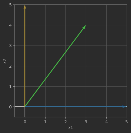
三维箭头图
# 导入包
import matplotlib.pyplot as plt

# 定义二维列表
A = [[0,5],
     [3,4],
     [5,0]]

# 自定义可视化函数
def draw_vector(vector,RBG):
    plt.quiver(0, 0, vector[0], vector[1],angles='xy',
               scale_units='xy',scale=1,color = RBG,
               zorder = 1e5)

fig, ax = plt.subplots()
v1 = A[0] # 第一行向量
draw_vector(v1,'#FFC000')
v2 = A[1] # 第二行向量
draw_vector(v2,'#00CC00')
v3 = A[2] # 第三行向量
draw_vector(v3,'#33A8FF')

ax.axvline(x = 0, c = 'k')
ax.axhline(y = 0, c = 'k')
ax.set_xlabel('x1')
ax.set_ylabel('x2')
ax.grid()
ax.set_aspect('equal', adjustable='box')
ax.set_xbound(lower = -0.5, upper = 5)
ax.set_ybound(lower = -0.5, upper = 5)
效果:
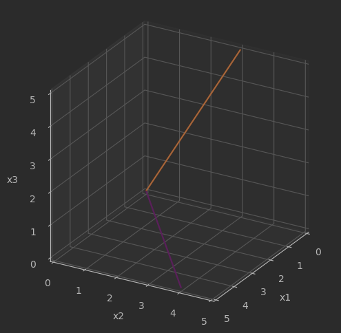
# 自定义可视化函数
def draw_vector_3D(vector,RBG):
    plt.quiver(0, 0, 0, vector[0], vector[1], vector[2],
               arrow_length_ratio=0, color = RBG,
               zorder = 1e5)

fig = plt.figure(figsize = (6,6))
ax = fig.add_subplot(111, projection='3d', proj_type = 'ortho')
# 第一列向量
v_1 = [row[0] for row in A]
draw_vector_3D(v_1,'#FF6600')
# 第二列向量
v_2 = [row[1] for row in A]
draw_vector_3D(v_2,'#FFBBFF')

ax.set_xlim(0,5)
ax.set_ylim(0,5)
ax.set_zlim(0,5)
ax.set_xlabel('x1')
ax.set_ylabel('x2')
ax.set_zlabel('x3')
ax.view_init(azim = 30, elev = 25)
ax.set_box_aspect([1,1,1])
效果: