flex-grow 属性
flex-grow 属性用于设置或检索弹性盒子的扩展比率。
默认值为0,表示不伸展。
flex-grow属性值为0时,不伸展:
<!doctype html>
<html lang="en">
	<head>
		<style>
			.d-flex {
				display: flex;
				width: 800px;
				height: 100px;
				border: 1px solid black;
			}

			.content {
				width: 200px;
				height: 100px;
				background-color: skyblue;
				border: 1px solid black;
			}
		</style>
	</head>
	<body>
		<div class="d-flex">
			<div class="content" style="flex-grow: 0;">1</div>
			<div class="content">2</div>
		</div>
	</body>
</html>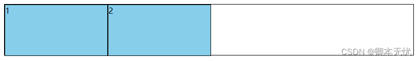
flex-grow属性值为1时伸展铺满整个容器:
<!doctype html>
<html lang="en">
	<head>
		<style>
			.d-flex {
				display: flex;
				width: 800px;
				height: 100px;
				border: 1px solid black;
			}

			.content {
				width: 200px;
				height: 100px;
				background-color: skyblue;
				border: 1px solid black;
			}
		</style>
	</head>
	<body>
		<div class="d-flex">
			<div class="content" style="flex-grow: 1;">1</div>
			<div class="content">2</div>
			<div class="content">3</div>
		</div>
	</body>
</html>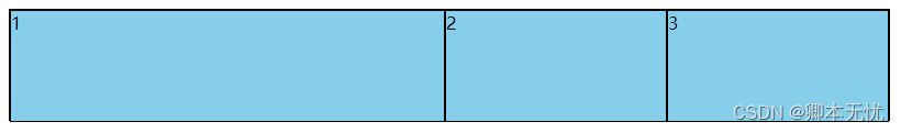
flex-grow属性值为2时,该项目的伸展比例是flex-grow属性值为1的项目的两倍:
<!doctype html>
<html lang="en">
	<head>
		<style>
			.d-flex {
				display: flex;
				width: 800px;
				height: 100px;
				border: 1px solid black;
			}

			.content {
				width: 200px;
				height: 100px;
				background-color: skyblue;
				border: 1px solid black;
			}
		</style>
	</head>
	<body>
		<div class="d-flex">
			<div class="content" style="flex-grow: 1;">1</div>
			<div class="content" style="flex-grow: 2;">2</div>
			<div class="content">3</div>
		</div>
	</body>
</html>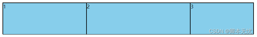
flex-shrink
flex-shrink 属性指定了 flex 元素的收缩规则。flex 元素仅在默认宽度之和大于容器的时候才会发生收缩,其收缩的大小是依据 flex-shrink 的值。
默认值为1,代表当项目空间不足时子item等比例收缩,设置为0时则不会收缩,item会超出容器范围。
flex-shrink属性值为0时,超出容器不收缩,其余item平均分配剩余空间:
<!doctype html>
<html lang="en">
	<head>
		<style>
			.d-flex {
				display: flex;
				width: 800px;
				height: 100px;
				border: 1px solid black;
			}

			.content {
				width: 200px;
				height: 100px;
				background-color: skyblue;
				border: 1px solid black;
			}
		</style>
	</head>
	<body>
		<div class="d-flex">
			<div class="content" style="flex-shrink: 0;">1</div>
			<div class="content">2</div>
			<div class="content">3</div>
			<div class="content">4</div>
			<div class="content">5</div>
		</div>
	</body>
</html>
flex-shrink属性值为2时,该项目的收缩比例是flex-shrink属性值为1的项目的两倍:
<!doctype html>
<html lang="en">
	<head>
		<style>
			.d-flex {
				display: flex;
				width: 800px;
				height: 100px;
				border: 1px solid black;
			}

			.content {
				width: 200px;
				height: 100px;
				background-color: skyblue;
				border: 1px solid black;
			}
		</style>
	</head>
	<body>
		<div class="d-flex">
			<div class="content" style="flex-shrink: 0;">1</div>
			<div class="content" style="flex-shrink: 1;">2</div>
			<div class="content" style="flex-shrink: 1;">3</div>
			<div class="content" style="flex-shrink: 2;">4</div>
			<div class="content" style="flex-shrink: 2;">5</div>
		</div>
	</body>
</html>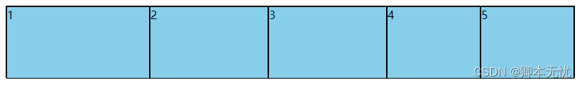
flex-basis
flex-basis 属性用于设置或检索弹性盒伸缩基准值。
默认值为auto,可设置一个长度单位或者一个百分比。
决定item最终size的因素,从优先级高到低:
max-width\max-height\min-width\min-height
flex-basis
width\height
内容本身的 size
flex-basis属性值设置:
<!doctype html>
<html lang="en">
	<head>
		<style>
			.d-flex {
				display: flex;
				width: 800px;
				height: 100px;
				border: 1px solid black;
			}

			.content {
				width: 200px;
				height: 100px;
				background-color: skyblue;
				border: 1px solid black;
			}
		</style>
	</head>
	<body>
		<div class="d-flex">
			<div class="content" style="flex-basis: 50%;">1</div>
			<div class="content" style="flex-basis: 50px;">2</div>
			<div class="content" style="flex-basis: 200px;">3</div>
		</div>
	</body>
</html>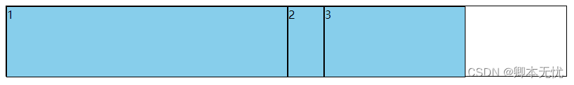
flex
flex 属性用于设置或检索弹性盒模型对象的子元素如何分配空间。
flex 属性是 flex-grow、flex-shrink 和 flex-basis 属性的简写属性。
CSS语法:
flex: flex-grow flex-shrink flex-basis|auto|initial|inherit;
auto 与 1 1 auto 相同。(伸展、收缩) :
<!doctype html>
<html lang="en">
	<head>
		<style>
			.d-flex {
				display: flex;
				width: 800px;
				height: 100px;
				border: 1px solid black;
			}

			.content {
				width: 200px;
				height: 100px;
				background-color: skyblue;
				border: 1px solid black;
			}
		</style>
	</head>
	<body>
		<div class="d-flex">
			<div class="content" style="flex: auto;">flex: auto;</div>
			<div class="content"></div>
		</div>
		<div class="d-flex">
			<div class="content" style="flex: 1 1 auto;">flex: 1 1 auto;</div>
			<div class="content"></div>
		</div>
	</body>
</html>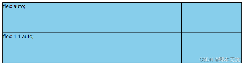
none 与 0 0 auto 相同。(不伸展、不收缩):
<!doctype html>
<html lang="en">
	<head>
		<style>
			.d-flex {
				display: flex;
				width: 800px;
				height: 100px;
				border: 1px solid black;
			}

			.content {
				width: 200px;
				height: 100px;
				background-color: skyblue;
				border: 1px solid black;
			}
		</style>
	</head>
	<body>
		<div class="d-flex">
			<div class="content" style="flex: none;">flex: none;</div>
			<div class="content"></div>
		</div>
		<div class="d-flex">
			<div class="content" style="flex: 0 0 auto;">flex: 0 0 auto;</div>
			<div class="content"></div>
		</div>
	</body>
</html>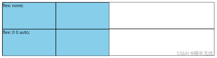
initial 设置该属性为它的默认值,即为 0 1 auto。(不伸展、收缩):
<!doctype html>
<html lang="en">
<head>
<style>
.d-flex {
display: flex;
width: 800px;
height: 100px;
border: 1px solid black;
}
.content {
width: 200px;
height: 100px;
background-color: skyblue;
border: 1px solid black;
}
</style>
</head>
<body>
<div class="d-flex">
<div class="content" style="flex: initial;">flex: initial;</div>
<div class="content"></div>
<div class="content"></div>
<div class="content"></div>
<div class="content"></div>
</div>
<div class="d-flex">
<div class="content" style="flex: 0 1 auto;">flex: 0 1 auto;</div>
<div class="content"></div>
<div class="content"></div>
<div class="content"></div>
<div class="content"></div>
</div>
</body>
</html>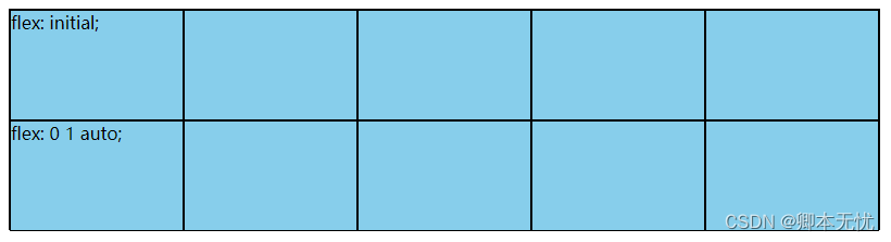 flex单值语法
无单位数(flex: <number>): 它会被当作flex:<number> 1 0 的值。flex-shrink的值被假定为1,即可以伸缩。flex-basis的值被假定为0,默认是没有宽度的。
有效的宽度值: 它会被当作 <flex-basis> 的值。
给一个item设置flex: <number>
<!doctype html>
<html lang="en">
<head>
<style>
.d-flex {
display: flex;
width: 800px;
height: 100px;
border: 1px solid black;
}
.content {
width: 200px;
height: 100px;
background-color: skyblue;
border: 1px solid black;
}
</style>
</head>
<body>
<div class="d-flex">
<div class="content" style="flex: 1;">flex: 1;</div>
<div class="content"></div>
<div class="content"></div>
</div>
</body>
</html>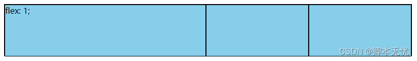 给多个item设置flex: <number>
<!doctype html>
<html lang="en">
	<head>
		<style>
			.d-flex {
				display: flex;
				width: 800px;
				height: 100px;
				border: 1px solid black;
			}

			.content {
				width: 200px;
				height: 100px;
				background-color: skyblue;
				border: 1px solid black;
			}
		</style>
	</head>
	<body>
		<div class="d-flex">
			<div class="content" style="flex: 1;">flex: 1;</div>
			<div class="content" style="flex: 2;">flex: 2;</div>
			<div class="content" style="flex: 3;">flex: 3;</div>
		</div>
	</body>
</html>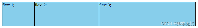
给item设置有效宽度值(item总长度大于父容器,所以item会等比列收缩):
<!doctype html>
<html lang="en">
	<head>
		<style>
			.d-flex {
				display: flex;
				width: 800px;
				height: 100px;
				border: 1px solid black;
			}

			.content {
				width: 200px;
				height: 100px;
				background-color: skyblue;
				border: 1px solid black;
			}
		</style>
	</head>
	<body>
		<div class="d-flex">
			<div class="content" style="flex: 500px;">flex: 500px;</div>
			<div class="content"></div>
			<div class="content"></div>
		</div>
	</body>
</html>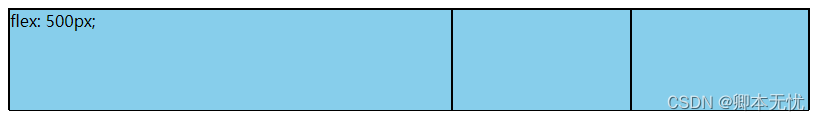
flex双值语法
第一个值必须为一个无单位数,并且它会被当作 <flex-grow> 的值。
第二个值必须为以下之一:
一个无单位数:它会被当作 <flex-shrink> 的值。
一个有效的宽度值: 它会被当作 <flex-basis> 的值。
flex: <number> <number>
<!doctype html>
<html lang="en">
	<head>
		<style>
			.d-flex {
				display: flex;
				width: 800px;
				height: 100px;
				border: 1px solid black;
			}

			.content {
				width: 200px;
				height: 100px;
				background-color: skyblue;
				border: 1px solid black;
			}
		</style>
	</head>
	<body>
		<div class="d-flex">
			<div class="content" style="flex: 0 0;">flex: 0 0;</div>
			<div class="content" style="flex: 1 0;">flex: 1 0;</div>
			<div class="content" style="flex: 1 1;">flex: 1 1;</div>
			<div class="content"></div>
		</div>
	</body>
</html>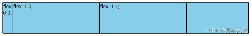
flex: <number> 有效宽度值
<!doctype html>
<html lang="en">
	<head>
		<style>
			.d-flex {
				display: flex;
				width: 800px;
				height: 100px;
				border: 1px solid black;
			}

			.content {
				width: 200px;
				height: 100px;
				background-color: skyblue;
				border: 1px solid black;
			}
		</style>
	</head>
	<body>
		<div class="d-flex">
			<div class="content" style="flex: 0 0;">flex: 0 0;</div>
			<div class="content" style="flex: 0 150px;">flex: 0 150px;</div>
			<div class="content" style="flex: 1 150px;">flex: 1 150px;</div>
			<div class="content"></div>
		</div>
	</body>
</html>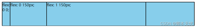
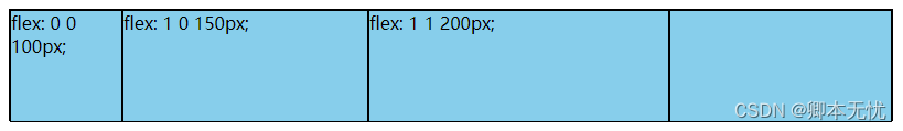
flex三值语法
第一个值必须为一个无单位数,并且它会被当作 <flex-grow> 的值。
第二个值必须为一个无单位数,并且它会被当作 <flex-shrink> 的值。
第三个值必须为一个有效的宽度值, 并且它会被当作 <flex-basis> 的值。
<!doctype html>
<html lang="en">
	<head>
		<style>
			.d-flex {
				display: flex;
				width: 800px;
				height: 100px;
				border: 1px solid black;
			}

			.content {
				width: 200px;
				height: 100px;
				background-color: skyblue;
				border: 1px solid black;
			}
		</style>
	</head>
	<body>
		<div class="d-flex">
			<div class="content" style="flex: 0 0 100px;">flex: 0 0 100px;</div>
			<div class="content" style="flex: 1 0 150px;">flex: 1 0 150px;</div>
			<div class="content" style="flex: 1 1 200px;">flex: 1 1 200px;</div>
			<div class="content"></div>
		</div>
	</body>
</html>