上一章讲了Fiori开发中的 Responsiveness(响应式设计)。
SAP学习笔记 - 开发30 - 前端Fiori开发 Responsiveness(响应式设计)-CSDN博客
本章继续学习Fiori 开发中的知识。
目录
下面是详细内容。
1,Device Adaptation(设备自适应)
先来看一下具体改了什么文件,达到了什么效果。
简单来说就是实现折叠一部分组件,以节约空间。
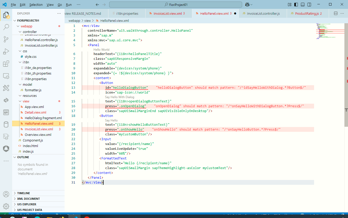
1),HelloPanel.view.xml
<mvc:View
	controllerName="ui5.walkthrough.controller.HelloPanel"
	xmlns="sap.m"
	xmlns:mvc="sap.ui.core.mvc">
	<Panel
		headerText="{i18n>helloPanelTitle}"
		class="sapUiResponsiveMargin"
		width="auto"
		expandable="{device>/system/phone}"
		expanded="{= !${device>/system/phone} }">
		<content>
			<Button
				id="helloDialogButton"
				icon="sap-icon://world"
				text="{i18n>openDialogButtonText}"
				press=".onOpenDialog"
				class="sapUiSmallMarginEnd sapUiVisibleOnlyOnDesktop"/>
			<Button
				text="{i18n>showHelloButtonText}"
				press=".onShowHello"
				class="myCustomButton"/>
			<Input
				value="{/recipient/name}"
				valueLiveUpdate="true"
				width="60%"/>
			<FormattedText
				htmlText="Hello {/recipient/name}"
				class="sapUiSmallMargin sapThemeHighlight-asColor myCustomText"/>
		</content>
	</Panel>
</mvc:View>
在Panel 组件里面,用下面属性来启动自适应:
- expandable="{device>/system/phone}" =》在设备为 phone 的时候,会启用折叠
- expanded="{= !${device>/system/phone} }"> =》该状态指明该部分是否已经处于折叠状态
- sapUiVisibleOnlyOnDesktop =》该CSS 样式用于只显示于Desktop 模式下
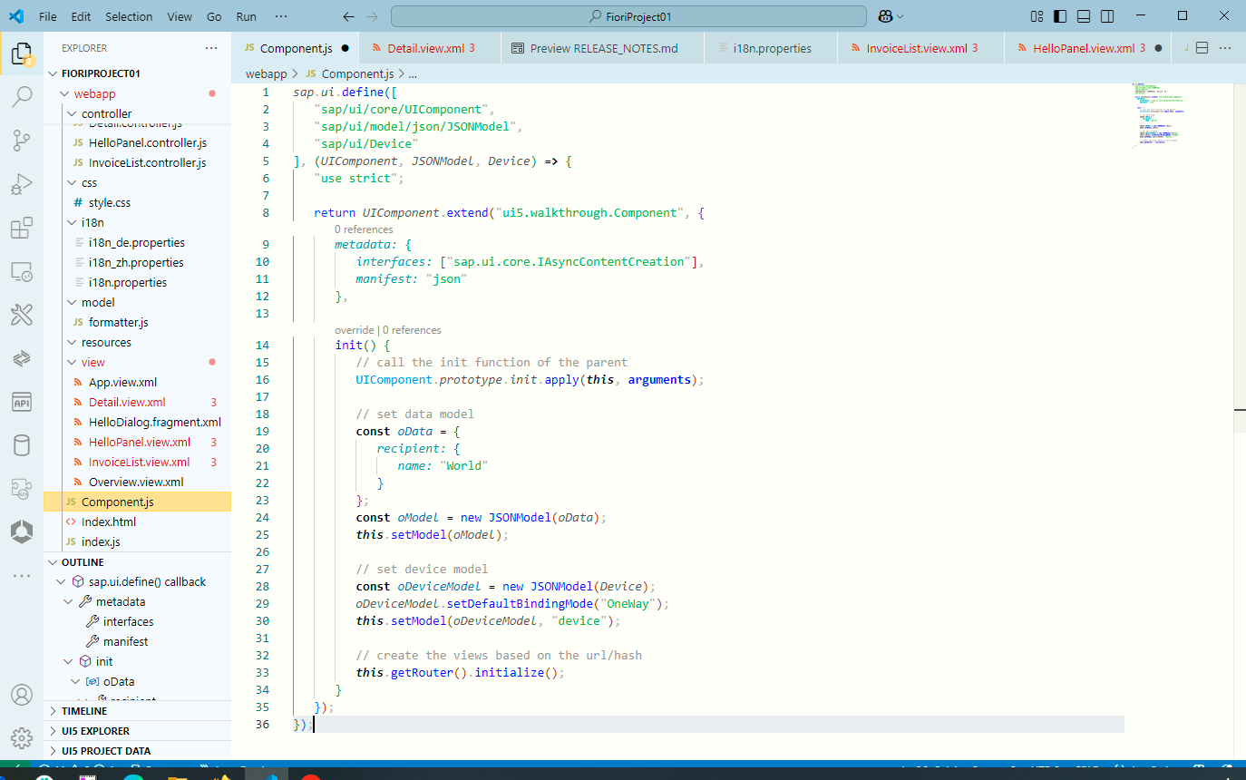
2),Component.js
sap.ui.define([
	"sap/ui/core/UIComponent",
	"sap/ui/model/json/JSONModel",
	"sap/ui/Device"
], (UIComponent, JSONModel, Device) => {
	"use strict";

	return UIComponent.extend("ui5.walkthrough.Component", {
		metadata: {
			interfaces: ["sap.ui.core.IAsyncContentCreation"],
			manifest: "json"
		},

		init() {
			// call the init function of the parent
			UIComponent.prototype.init.apply(this, arguments);

			// set data model
			const oData = {
				recipient: {
					name: "World"
				}
			};
			const oModel = new JSONModel(oData);
			this.setModel(oModel);

			// set device model
			const oDeviceModel = new JSONModel(Device);
			oDeviceModel.setDefaultBindingMode("OneWay");
			this.setModel(oDeviceModel, "device");

			// create the views based on the url/hash
			this.getRouter().initialize();
		}
	});
});
- 指定Device Model为单向模式(默认是双向绑定)
const oDeviceModel = new JSONModel(Device);
oDeviceModel.setDefaultBindingMode("OneWay");
this.setModel(oDeviceModel, "device");
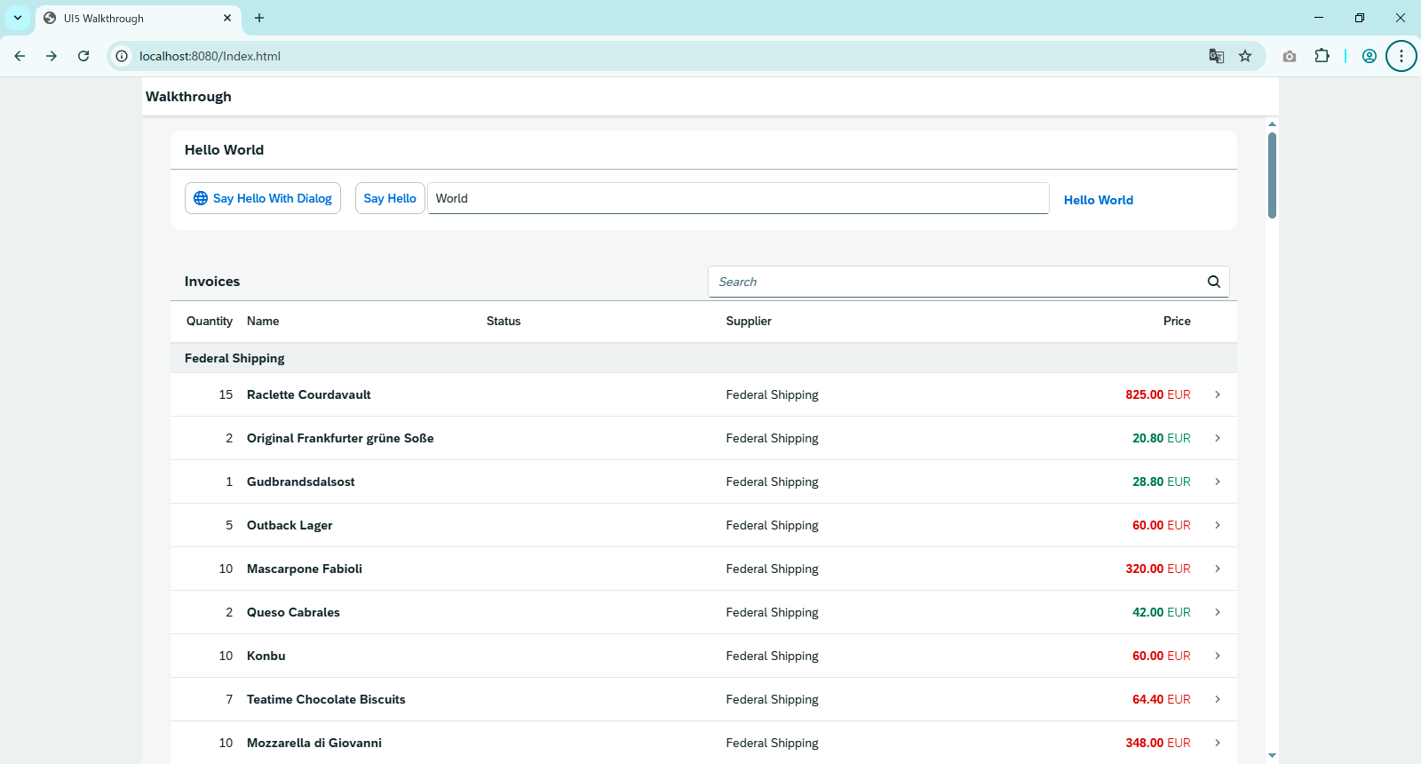
3),运行看效果
其实就是指定一部分对象作为折叠对象,然后引入Device模块,之后SAP Fiori就全帮你干了。
好像没啥变化哈~
因为这是Desktop 中显示,咱们给调成 phone 模式显示
按 F12,然后调成 phone 模式
这样就会显示折叠
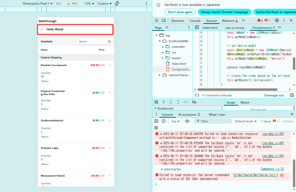
点一下可以展开折叠或再次折叠
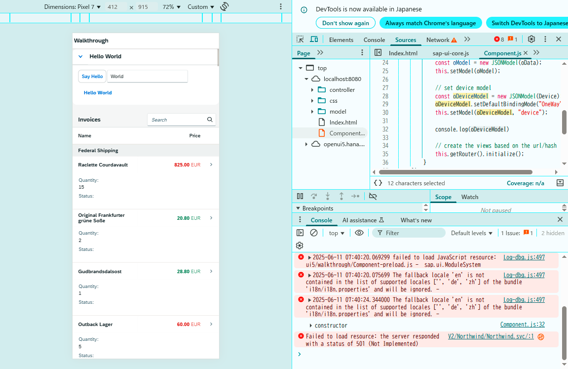
上面在列表上搞了个折叠,当是phone模式的时候,会自适应为折叠。
下面看看在明细画面也做下优化。
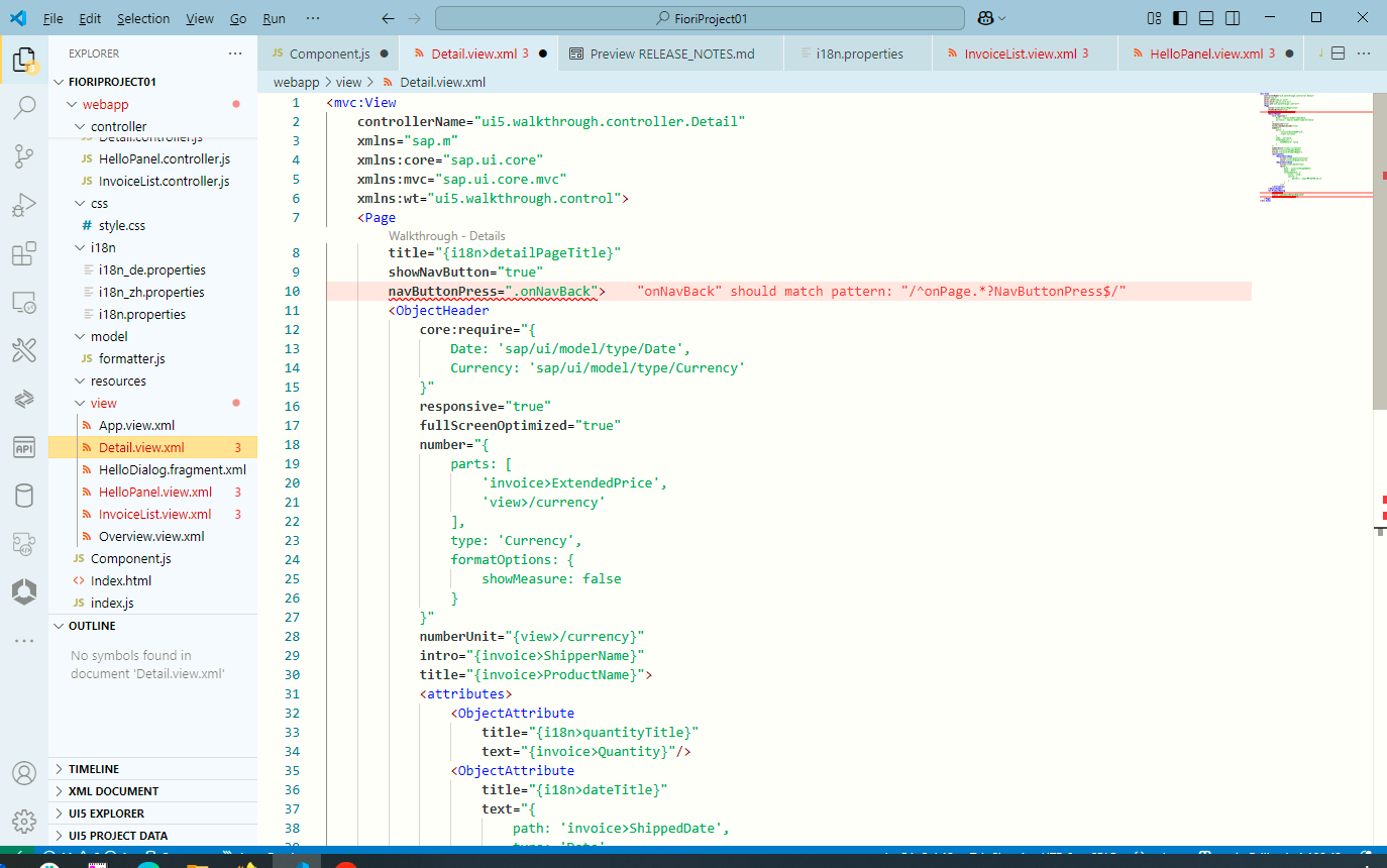
4),Detail.view.xml
<mvc:View
    controllerName="ui5.walkthrough.controller.Detail"
    xmlns="sap.m"
    xmlns:core="sap.ui.core"
    xmlns:mvc="sap.ui.core.mvc"
    xmlns:wt="ui5.walkthrough.control">
    <Page
        title="{i18n>detailPageTitle}"
        showNavButton="true"
        navButtonPress=".onNavBack">
        <ObjectHeader
            core:require="{
                Date: 'sap/ui/model/type/Date',
                Currency: 'sap/ui/model/type/Currency'
            }"
            responsive="true"
            fullScreenOptimized="true"
            number="{
                parts: [
                    'invoice>ExtendedPrice',
                    'view>/currency'
                ],
                type: 'Currency',
                formatOptions: {
                    showMeasure: false
                }
            }"
            numberUnit="{view>/currency}"
            intro="{invoice>ShipperName}"
            title="{invoice>ProductName}">
            <attributes>
                <ObjectAttribute
                    title="{i18n>quantityTitle}"
                    text="{invoice>Quantity}"/>
                <ObjectAttribute
                    title="{i18n>dateTitle}"
                    text="{
                        path: 'invoice>ShippedDate',
                        type: 'Date',
                        formatOptions: {
                            style: 'long',
                            source: {
                                pattern: 'yyyy-MM-ddTHH:mm:ss'
                            }
                        }
                    }"/>
            </attributes>
        </ObjectHeader>
        <wt:ProductRating
            id="rating"
            class="sapUiSmallMarginBeginEnd"
            change=".onRatingChange"/>
    </Page>
</mvc:View>
- 通过两句就是启动 ObjectHeader 组件的自适应模式
responsive="true"
fullScreenOptimized="true"
- 那么自适应对象是谁呢?就是这个 <attributes> 部分。
和上面在 HelloPanel.view.xml 作用在 panel 组件上,用的是不同的属性。
<attributes>
<ObjectAttribute
title="{i18n>quantityTitle}"
text="{invoice>Quantity}"/>
<ObjectAttribute
title="{i18n>dateTitle}"
text="{
path: 'invoice>ShippedDate',
type: 'Date',
formatOptions: {
style: 'long',
source: {
pattern: 'yyyy-MM-ddTHH:mm:ss'
}
}
}"/>
</attributes>
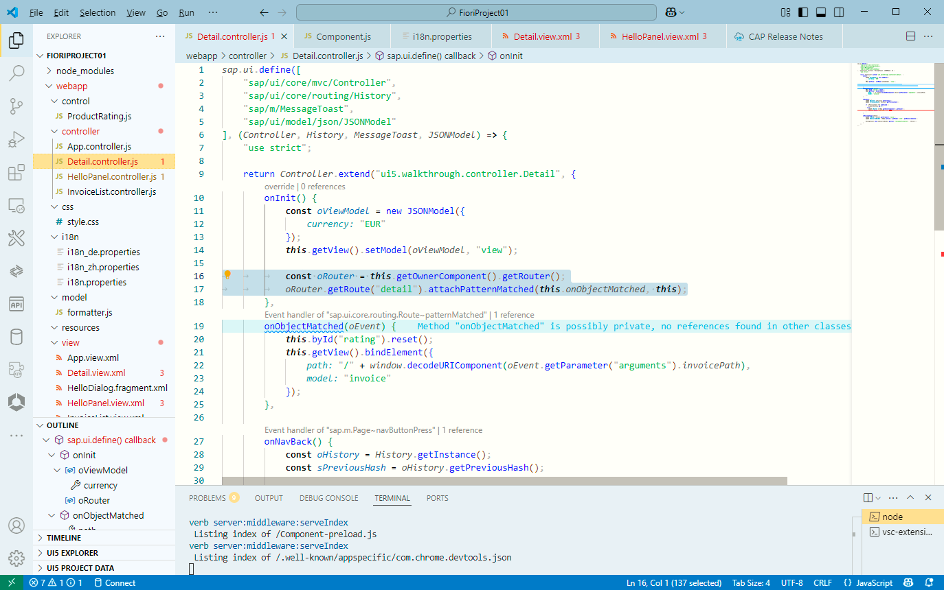
5),Detail.controller.js
sap.ui.define([
	"sap/ui/core/mvc/Controller",
	"sap/ui/core/routing/History",
	"sap/m/MessageToast",
	"sap/ui/model/json/JSONModel"
], (Controller, History, MessageToast, JSONModel) => {
	"use strict";

	return Controller.extend("ui5.walkthrough.controller.Detail", {
		onInit() {
			const oViewModel = new JSONModel({
				currency: "EUR"
			});
			this.getView().setModel(oViewModel, "view");

			const oRouter = this.getOwnerComponent().getRouter();
			oRouter.getRoute("detail").attachPatternMatched(this.onObjectMatched, this);
		},
		…
	});
});
这里没啥,就是为了在详细页面加几个字段,比如这个Currency,所以加的Model而已
6),运行看效果
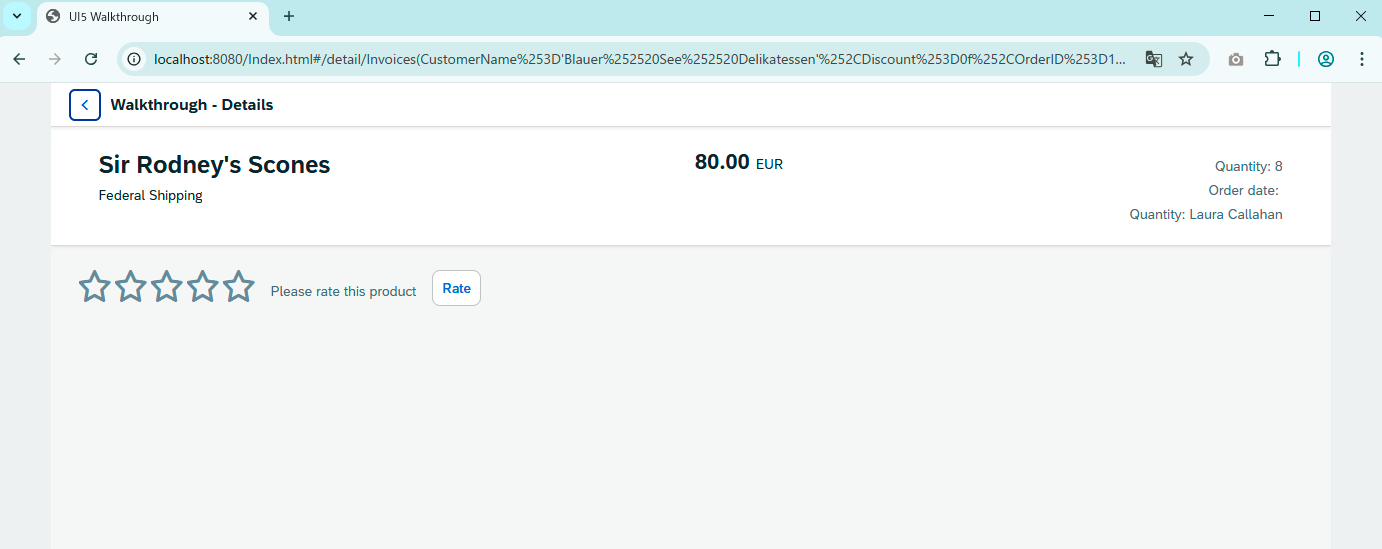
点任意一条明细,显示下面画面
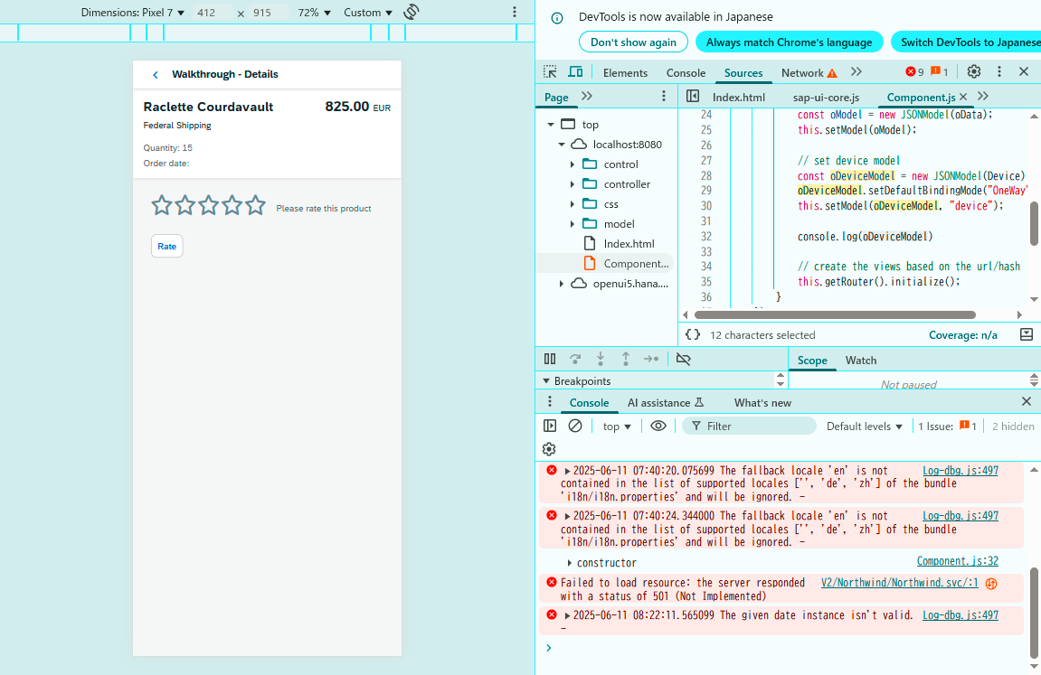
哦,我这个用的Remote Data,Order Date 在Meta Data 里没暴漏出来。
我再加一个字段,然后再看看。
默认Destop Web 是这样的:有几个字段是靠右的
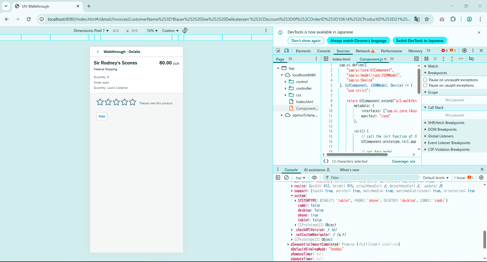
调成 phone 模式之后,就变成这样的
其实就是适应手机屏幕尺寸,把一些字段给调在下面表示了
官方资料里提供的是这两种方式,在实际开发当中还是挺常用的。
其他的肯定还有,官方暂时没提供Sample,以后有Sample再说。
以上就是本篇的全部内容。
更多SAP顾问业务知识请点击下面目录链接或东京老树根的博客主页