前言
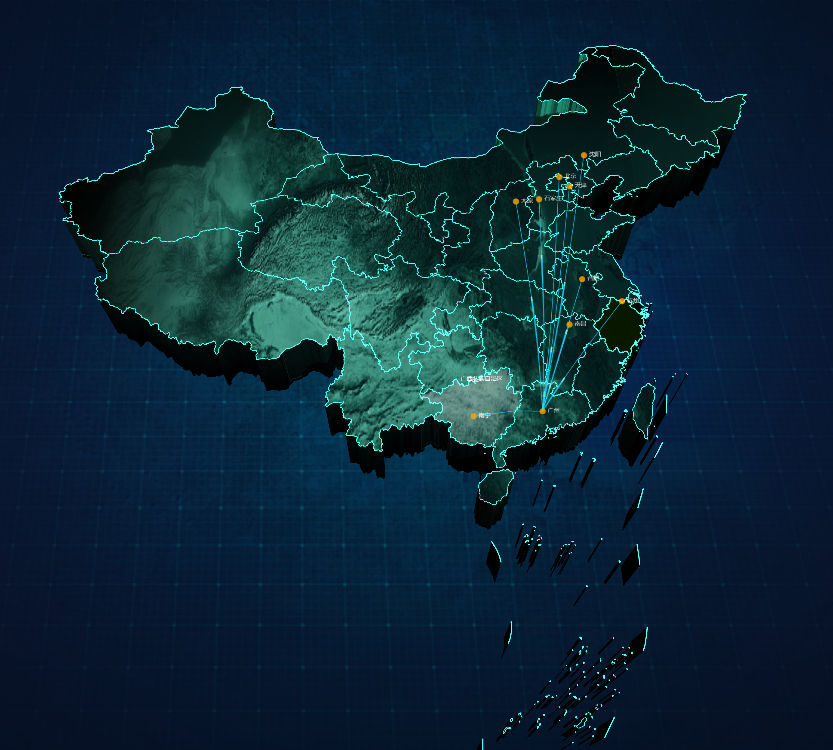
在现代数据可视化领域,3D 地图飞线效果是一种非常吸引人的展示方式,特别适合展示地理空间关系和数据流动。本文将详细解析如何使用 ECharts GL 在 Vue 项目中实现一个 3D 中国地图飞线效果。
技术栈
Vue.js 2.x/3.x
ECharts 5.x
ECharts GL 2.x
核心实现步骤
1. 准备工作
首先需要安装必要的依赖:
npm install echarts echarts-gl --save2. 基础地图配置
import * as echarts from 'echarts'
import "echarts-gl";
import chinaJson from '@/utils/chinaOutline.json'

export default {
  mounted() {
    this.initChart()
  },
  methods: {
    initChart() {
      const dom = this.$refs.chartRef;
      this.myChart = echarts.init(dom);
      echarts.registerMap('china', chinaJson);
      // ...其他配置
    }
  }
}
3. 数据处理
我们需要准备两类数据:
城市点位数据 - 用于在地图上显示城市位置
飞线数据 - 用于显示从起点到各城市的连线
const FROMCITY = [113.28064, 23.125177]  // 起点坐标(深圳)
const FROMCITYCOORD = [113.28064, 23.125177]

// 处理飞线数据
const linesData = this.cityList.map(city => ({
  fromName: FROMCITY,
  toName: city.city,
  coords: [
    [FROMCITYCOORD[0], FROMCITYCOORD[1], 1],
    [city.provinceCapitalX, city.provinceCapitalY, 1]
  ],
}));

// 处理散点数据
const scatterData = this.cityList.map(city => ({
  name: city.city.replace('市', ''),
  value: [city.provinceCapitalX, city.provinceCapitalY, 1],
}));
4. 3D 地图核心配置
geo3D: {
  map: 'china',
  regionHeight: 8,  // 区域高度
  itemStyle: {
    color: 'RGBA(153, 249, 235, 1)',  // 地图基础颜色
    borderWidth: 1.5
  },
  viewControl: {
    distance: 110,  // 观察距离
    alpha: 60,      // 上下旋转角度
    beta: 0         // 左右旋转角度
  },
  // ...其他配置
}
5. 飞线系列配置
{
  type: 'lines3D',
  effect: {
    show: true,
    period: 4,            // 动画周期
    trailWidth: 4,        // 尾迹宽度
    symbol: 'arrow',      // 箭头符号
    color: 'rgba(255,255,255, 1)'
  },
  lineStyle: {
    width: 1.5,
    color: '#1AD9FF',     // 飞线颜色
    opacity: 0.8
  },
  data: linesData         // 飞线数据
}
6. 城市点位配置
{
  type: 'scatter3D',
  symbol: 'circle',
  symbolSize: 14,
  label: {
    show: true,
    formatter: '{b}',     // 显示城市名称
    color: '#FFF'
  },
  itemStyle: {
    color: '#FFA601'      // 点颜色
  },
  data: scatterData       // 散点数据
}
完整代码解析
setChartInit() {
  const dom = this.$refs.chartRef;
  this.myChart = this.myChart || echarts.init(dom);

  // 注册地图
  echarts.registerMap('china', chinaJson);

  // 准备数据
  const linesData = this.cityList.map(city => ({
    fromName: FROMCITY,
    toName: city.city,
    coords: [
      [FROMCITYCOORD[0], FROMCITYCOORD[1], 1],
      [city.provinceCapitalX, city.provinceCapitalY, 1]
    ],
  }));

  const scatterData = this.cityList.map(city => ({
    name: city.city.replace('市', ''),
    value: [city.provinceCapitalX, city.provinceCapitalY, 1],
  }));

  // 配置项
  const option = {
    // 3D地图配置
    geo3D: {
      map: 'china',
      regionHeight: 8,
      // ...其他geo3D配置
    },
    series: [
      // 飞线系列
      {
        type: 'lines3D',
        // ...飞线配置
        data: linesData
      },
      // 点位系列
      {
        type: 'scatter3D',
        // ...点位配置
        data: scatterData
      }
    ]
  };

  this.myChart.setOption(option);
}
完整代码
<template>
    <div class="chartRef" ref="chartRef" style="height: 100%;width: 100%" />
</template>
<script>

import * as echarts from 'echarts'
import '@/utils/chinaMap'
import "echarts-gl";
import chinaJson from '@/utils/chinaOutline.json'

const FROMCITY = [113.28064, 23.125177]
const FROMCITYCOORD = [113.28064, 23.125177]

export default {
  name: 'Demo',

  data() {
    return {

      cityList:[
  {
    "id": 0,
    "city": "绍兴市",
    "provinceCapitalX": "120.15358",
    "provinceCapitalY": "30.287458",
    "num": 200
  },
  {
    "id": 1,
    "city": "北京市",
    "provinceCapitalX": "116.405289",
    "provinceCapitalY": "39.904987",
    "num": 200
  },
  {
    "id": 2,
    "city": "嘉兴市",
    "provinceCapitalX": "120.15358",
    "provinceCapitalY": "30.287458",
    "num": 200
  },
  {
    "id": 3,
    "city": "锦州市",
    "provinceCapitalX": "118.76741",
    "provinceCapitalY": "41.796768",
    "num": 200
  },
  {
    "id": 4,
    "city": "临沂市",
    "provinceCapitalX": "120.15358",
    "provinceCapitalY": "30.287458",
    "num": 200
  },
  {
    "id": 5,
    "city": "深圳市",
    "provinceCapitalX": "113.28064",
    "provinceCapitalY": "23.125177",
    "num": 200
  }
],

    }
  },
  mounted() {
    this.getData()

  },
  watch: {

  },
  methods: {
   // 地图组件初始加载
    setChartInit() {
      const dom = this.$refs.chartRef;
      this.myChart = this.myChart || echarts.init(dom);
      echarts.registerMap('china', chinaJson);
      const linesData = this.cityList.map(city => ({
        fromName: FROMCITY,
        toName: city.city,
        coords: [[FROMCITYCOORD[0], FROMCITYCOORD[1], 1], [city.provinceCapitalX, city.provinceCapitalY, 1]],
      }));
      const scatterData = this.cityList.map(city => ({
        name: city.city.replace('市', ''),
        value: [city.provinceCapitalX, city.provinceCapitalY, 1],
      }));

      const option = {
        tooltip: {
          trigger: 'axis',
          axisPointer: {
            type: 'shadow'
          }
        },
        backgroundColor: 'transparent',
        geo3D: {
          zlevel: 1,
          type: 'geo3D',
          coordinateSystem: 'geo3D',
          map: 'china',
          regionHeight: 8,
          roam: false,
          silent: false,
          select: {
            disabled: false
          },
          itemStyle: {
            borderColor: 'RGBA(37, 182, 144, 0)',
            color: 'RGBA(153, 249, 235, 1)',
            borderWidth: 1.5
          },
          shading: "realistic",
          realisticMaterial: {
            detailTexture: "./bg.png",
            textureTiling: 1,
            blendMode: 'Additive', // 可选值:Additive / Subtractive / Multiply 等
          },
          light: {
            main: {
              intensity: 1.2,
              shadow: true,
              shadowQuality: 'high'
            },
            ambient: {
              intensity: 0.3
            }
          },
          viewControl: {
            distance: 110,
            alpha: 60,
            beta: 0,
            autoRotate: false,
            rotateSensitivity: 1,
            zoomSensitivity: 1,
            panSensitivity: 1
          },
          emphasis: {
            label: {
              show: true,
              color: 'RGBA(255, 255, 255, 1)',
              fontSize: 14,
            },
            itemStyle: {
              color: 'RGBA(255, 255, 255, 1)',
              borderWidth: 4,
              borderColor: "RGBA(255,255,255, 1)",
              regionHeight: 25,
              opacity: 1,
              shadowColor: 'RGBA(153, 249, 235, 1)'
            }
          },

        },

        series: [
          // 飞线系列
          {
            type: 'lines3D',
            coordinateSystem: 'geo3D',
            zlevel: 2,
            silent: true,
            effect: {
              show: true,
              period: 4,
              trailWidth: 4,
              trailLength: 0.4,
              symbol: 'arrow',
              symbolSize: 16,
              color: 'rgba(255,255,255, 1)'
            },
            lineStyle: {
              width: 1.5,
              color: '#1AD9FF',
              opacity: 0.8
            },
            data: linesData
          },

          // 点位系列
          {
            type: 'scatter3D',
            coordinateSystem: 'geo3D',
            zlevel: 3,
            symbol: 'circle',
            symbolSize: 14,
            silent: false,
            label: {
              show: true,
              position: 'right',
              formatter: '{b}',
              textStyle: {
                color: '#FFF',
                fontSize: 14
              }
            },
            itemStyle: {
              color: '#FFA601'
            },
            emphasis: {
              label: {
                show: false
              },
              itemStyle: {
                color: '#1AD9FF'
              }
            },
            data: scatterData
          }
        ]

      }
      this.myChart.setOption(option);
    }
  }
}
</script>

<style scoped lang="scss">

</style>
效果优化技巧
动画效果:通过调整
effect.period可以改变飞线动画速度视觉层次:使用
zlevel控制不同图层的叠加顺序光照效果:调整
light配置可以改变地图的明暗效果交互体验:配置
viewControl可以控制地图的旋转、缩放等交互行为
常见问题解决
地图不显示:
确保正确注册了地图 JSON 数据
检查容器是否有固定宽高
飞线不显示:
检查坐标数据格式是否正确
确保 lines3D 系列被正确添加到 series 中
性能问题:
数据量过大时考虑简化或聚合数据
使用
silent: true减少不必要的交互检测
总结
通过 ECharts GL 实现 3D 地图飞线效果,可以为地理空间数据提供更加直观的展示方式。本文详细介绍了从数据准备到最终实现的完整流程,以及各种配置项的用途和优化技巧。这种可视化方式特别适合展示城市间的关联关系、物流路线、人口迁移等场景。
希望这篇技术解析能帮助你在项目中实现类似的效果。如果有任何问题,欢迎在评论区讨论。